Greetings Glide Family,
I have already shared with Glide support that the Glide app presents itself (User Experience) a little different across a variety of mobile devices (phones and tablets) based on the actual dimensions of the device screens. I believe they may be working on a fix for this but I wanted to share this with other fellow Glide Developers in the event that you have any Users who register this issue prior to a fix. I hope you find the visuals helpful. ![]()
PREMISE
ALL Glide apps should provide a consistent User Experience across mobile devices no matter the make or model but that’s not currently the case. We have tested our apps on various devices to identify one major user inconsistency that will render larger apps (lots of menus) unusable (or inconsistent) if used in one particular way.
INTERFACE CONSISTENCY:
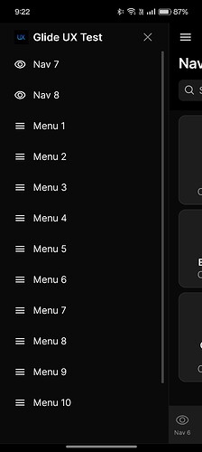
Holding mobile phones and tablets in Portrait mode (vertical orientation) when viewing Glide apps yields a consistent Glide left “Hamburger” menu interface across ALL of the devices that we tested.
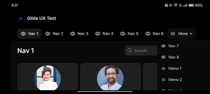
INTERFACE INCONSISTENCY: Holding some mobile phones or smaller tablets in Landscape mode (horizontal orientation) when viewing Glide apps yields one of two UX interfaces depending on what device your Users are using. Apps constructed with a larger number of Navigation or Menu tabs will encounter a usability issue with the New MORE… Drop-down navigation menu that WILL NOT display all of the extra Nav and Menu app tabs. They are simply cut off with no ability to scroll to them.
THE CONTROLLED EXPERIMENT:
We built a simple New Glide app with 8 Navigation tabs and 12 Menu tabs to illustrate our finding. Our Public app has been set to use the Left Navigation Layout setting but it really does not matter if it’s set to Left or Top because the issue presents the same. On some mobile phones and/or tablets of a particular size the Left set navigation will force display as Top layout anyway yielding a MORE drop-down menu that IS cut-off vertically and NOT scroll-able.
THE POSSIBLE SOLUTIONS:
-
Make the MORE drop-down menu scroll-able.
-
Force a Left Navigation Orientation on ALL Mobile devices in Landscape (Horizontal) orientation so that Users may use the “New” Collapsible Sidebar to clear up even more visual screen surface.
-
Just tell Users to hold the phone in Portrait orientation. Yeah, but that’s NOT really a consistent UX outcome if it’s NOT usable in Landscape orientation as well now is it?
THE FINDINGS ON TESTED DEVICES:
Below are visual screen-shots of the same test Glide UX app across our various mobile testing devices. Notice that iPhones seem to render consistently in Portrait & Lanscape orientations but slimmer Samsung devices and a larger foldable OnePlus Open device present with the non-fully accessible MORE dropdown navigation menu (also somehow forced into Top presentation even thought the app is set for Left Nav presentation).
iPhone 13 Portrait Orientation - Left Navigation Vertically Scroll-able
iPhone 13 Landscape Orientation - Left Navigation Vertically Scroll-able
iPhone 11 Pro Max Portrait Orientation - Left Navigation Vertically Scroll-able
iPhone 11 Pro Max Landscape Orientation - Left Navigation Vertically Scroll-able
Samsung Galaxy Note 20 Ultra Portrait Orientation - Left Navigation Vertically Scroll-able
Samsung Galaxy Note 20 Ultra Landscape Orientation - Left Navigation Vertically Scroll-able
Samsung Galaxy S20 FE Portrait Orientation - Left Navigation Vertically Scroll-able
Samsung Galaxy S20 FE Landscape Orientation - ![]() Forced Top Navigation MORE Menu NOT Vertically Scroll-able
Forced Top Navigation MORE Menu NOT Vertically Scroll-able
OnePlus Open Outside Screen Portrait Orientation - Left Navigation Vertically Scroll-able
OnePlus Open Outside Screen Landscape Orientation - ![]() Forced Top Navigation MORE Menu NOT Vertically Scroll-able
Forced Top Navigation MORE Menu NOT Vertically Scroll-able
OnePlus Open Inside Fully Unfolded Screen - ![]() Forced Top Navigation MORE Menu NOT Vertically Scroll-able. On this large of a screen Left Nav layout setting SHOULD NOT force a Top Nav orientation.
Forced Top Navigation MORE Menu NOT Vertically Scroll-able. On this large of a screen Left Nav layout setting SHOULD NOT force a Top Nav orientation.


