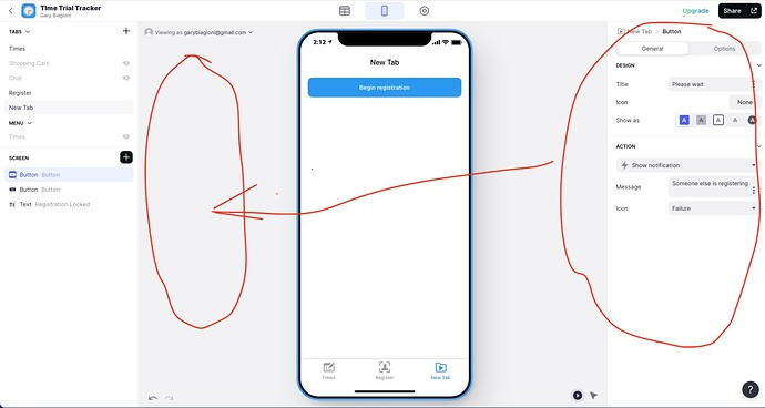
I am using the new issue of the Glide app builder. The one thing I would like is too move the tab pane and the detail pane side by side. I have a fairly wide screen and generally have my browser set wide because I want to see as much of a table as possible. I therefore have to move my head back and forth as I add/edit widgets. Just move the circle pane on the right to the noted spot on the left and cozy the phone image up to that. Would be better IMHO
This was discussed in the new builder thread at some point. I think there is a reason coming down the pipeline as to why it has been laid out that way.
/Edit not that particular answer. I’m on my phone so can’t seem to grab the right URL to link to the specific post, sorry.
Is it this
That’s the one! Thank you.
That is what happens now they slide out a window to let you pick the item and it disappears after you pick it. For me it could slide out over top of the detail page just as well as blank space. And I even have to swing my head out less, I just want to keep all the thing that I have to configure as close as possible. Just thinking…
