While Glide may not be mobile first, the usability and design on mobile is mostly very good. However with just a few tweaks the design and usability on mobile could be greatly improved.
One of our Glide Order Apps

Our tweaked concept
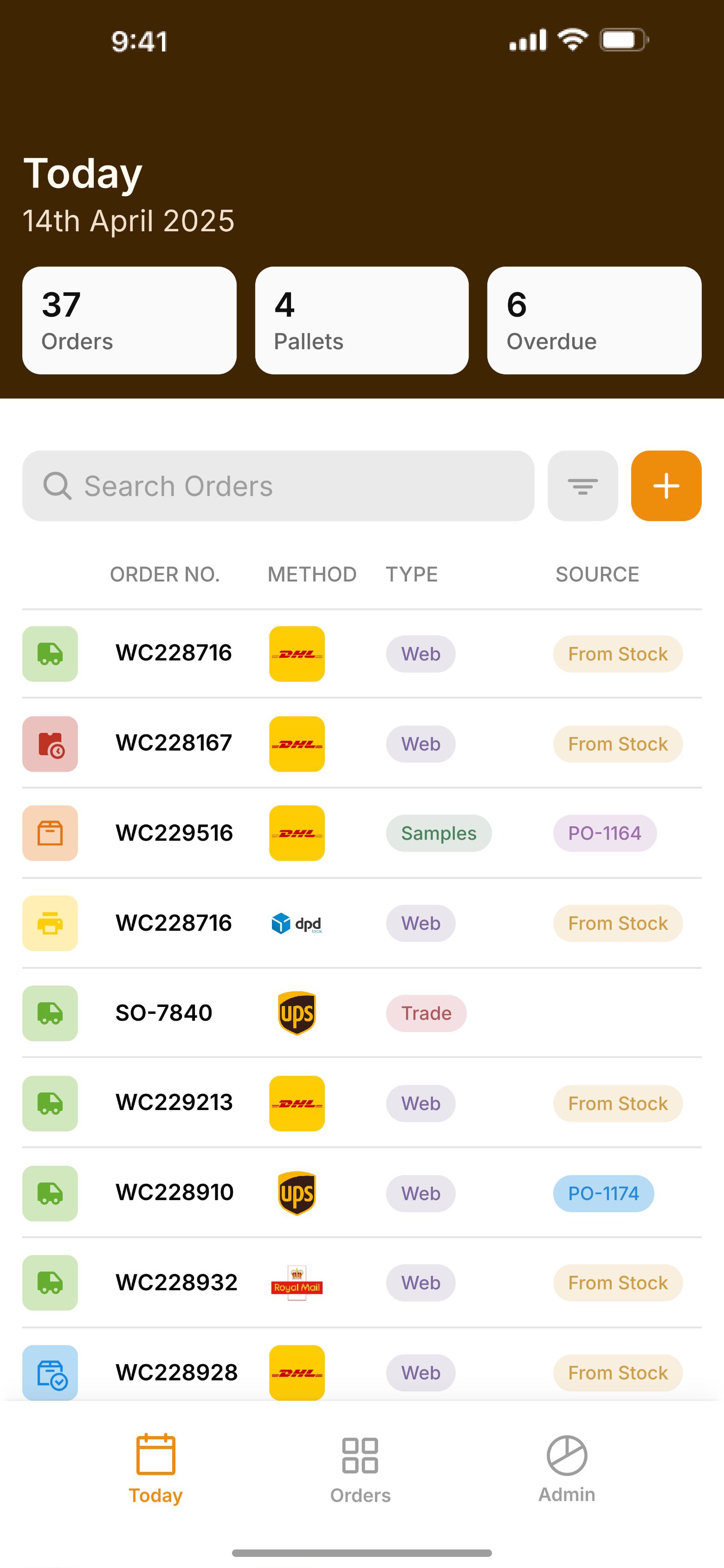
The key changes here are the number of big number boxes per row and the table action being inline with the search and filter. These changes save space allow for a denser, usable environment.
We see a similar situation across other apps. I believe the best solution would be to have a separate selection for both image and text sizes for mobile on most elements. This should resolve most of the spacing/sizing issues. Anyone have similar thoughts?