For the last two years, I’ve been using a paper based bullet journal. I’ve never found an app that could match it for functionality, so have planned on building my own. I had started a React Native course but then came across Glide somehow and recognised that I could quickly easily get what I wanted without having to spend months learning.
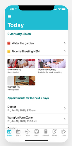
That was just 12 days ago that I discovered Glide. Here’s a screenie of the Bullet Journal app I’ve been working on over those last 12 days. Still amazed how much I’ve been able to achieve. As alluded, I do have a coding background (including Excel), which has helped with spreadsheet formulas, not that they’re that complicated.
Some things of note in that screen:
-
The sections you can see there are: Todos, Lists (the pictures) and Diary. If you scrolled down you’d also see entries from Daily, Journal and Notes.
-
The home screen itself is its own sheet. This just makes it less confusing than using one of the content sheets since Glide will always reference the fields on the tab’s sheet.
-
This also enabled me to make a neater way of creating the date by creating a column for it in that Home sheet (yep, didn’t call it Today). To colour the date, I used html span and did a lookup for the colour value in my Settings sheet. This is the formula and it goes in the top of the Today column:
={"Today";ArrayFormula(if(A2:A="","","### <span style='color:"&vlookup("TITLESCOLOUR",SortedSettings!A2:C,3)&"'>"&day(today())&" "&TEXT(today(),"MMMM")&", "&year(today())&"</span>"))}
Note: The Settings sheet is duplicated as SortedSettings and uses the sort() function to load the data as vlookup needs sorted tables.
=sort(Settings!A2:C)
-
The Appointments for the next 7 days also works in a similar way, looking up the value from the Settings for how many days to show.
-
A column in the Diary sheet also looks up that value and calculates whether the entry is within the number of days, returning a one or zero. That is then used in the Diary List component’s Filter settings to only show those with a value of 1 on this screen.
={"Next X Days";ArrayFormula(if(A2:A="","",(A2:A-today()<=vlookup("DAYSTOSHOW",SortedSettings!A2:C,3))*(A2:A-today()>0)))}
-
The Todo titles are created by making an If-Then-Else Column in Todo sheet using the Glide data editor that converts the priority to an emjoi, and then another TemplateColumn that concatenates the that column with the title column.
-
The Lists list has the item count in the title. This was done by adding a column to the List Content sheet that calculates 1 if incomplete or 0 if complete. Then, another sheet, List Counts uses the query() function to sum the totals for each list. I then used a Relation and Lookup Columns in the Lists sheet to get the totals in there where I then used a Template Column to create the title with counts. Here’s the query:
=sort(query(ListContent!L2:M,"select L, sum(M) group by L"))
-
Other than the Diary which works the way I described above, each of the content sheets has a Today column that is a checkbox, and when checked shows that entry on the Today screen.
-
Todos also have a due date, so will automatically appear if that matches today’s date.
-
The Notes and Journal also show automatically if I edit either today. This is done by having a “Last edit” column that is automatically populated using the “Current date time” component.
I think that’s about all for that screen! There are other bits of magic happening throughout the other screens, but this would get rather long! And I am considering writing a comprehensive tutorial.
One tip of my own, I recommend putting a “Key” column in each main content sheet and setting it to populate with the Unique Identifier component when created. The Favourites component needs a unique key and it’s much easier to set it up up front than having to go back thru your data and add it later. 
Oh, and if you use Arrayformula(), you need to use an if() statement to detect unpopulated rows in your sheet (as you can see in my formulas above) so that it doesn’t fill all your rows with data as that blows out your allowed rows count for Glide.
Hope there’s some useful info there for others. Thanks heaps to the community - especially Jeff - for various tips.
Please feel free to ask anything and ask for further explanations.

