i have been looking for custom css case on sidebar layout but no case related found.
p.s. Now using as enterprise
@Himaladin I remember you did something right?
I don’t fully understand what you’re trying to achieve. Could you please clarify?
Hi @Himaladin I just want to layer my layout, the left most menu on webapp screen.
Just asked if it possible to adjust by using custom CSS, Like Menu and Sub layer Or title and more separate line
Before diving in, could you clarify whether you want those sub-menus to be limited expandable/collapsible (only one open at a time, not fully toggleable), or just visually grouped with indentation or divider lines?
Also, how should it behave on mobile — should the same hierarchy appear in the side menu, or be simplified as a flat list?
This is quite a tricky layout to handle with CSS. I explored a similar idea earlier here: Group Tabs on Desktop Menu Tab Bar using CSS.
I haven’t re-tested that code recently, so some parts may need adjustment for the current Glide DOM.
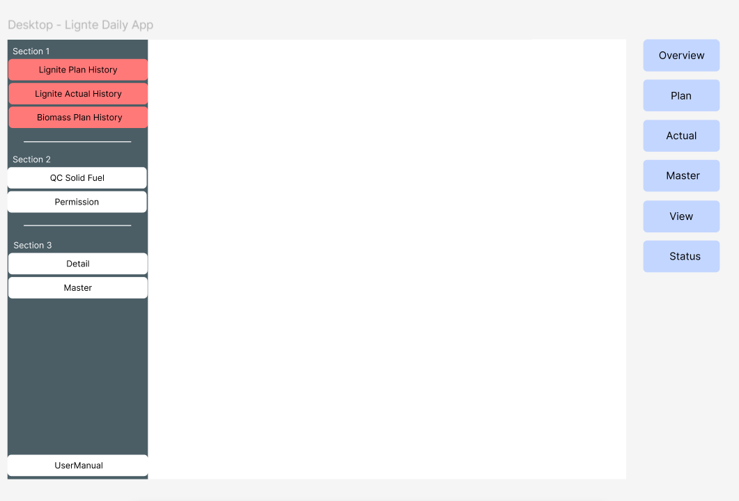
If you’d like to achieve something like what appears in your image, you can try this CSS:

/* ====== Sidebar Navigation Styling (Desktop Only) ====== */

/* Common ::before styling for all Sections */
#page-root:not(.mobile-layer) .sidebar-root li:is(:nth-of-type(1), :nth-of-type(4), :nth-of-type(7))::before {
  position: absolute;
  margin-top: -20px;
  font-size: 0.75rem;
  color: white;
}

/* Section 1 */
#page-root:not(:has(.mobile-layer)) .sidebar-root li:nth-of-type(1) {
  padding-top: 1.5rem;
}

/* Section 2 & 3: padding-top + border-top */
#page-root:not(:has(.mobile-layer)) .sidebar-root li:is(:nth-of-type(4), :nth-of-type(7)) {
  padding-top: 1.5rem;
  border-top: 1px solid gray;
}

/* Section 1, 2 & 3: ::before content */
#page-root:not(:has(.mobile-layer)) .sidebar-root li:nth-of-type(1)::before {content: "Section 1";}
#page-root:not(:has(.mobile-layer)) .sidebar-root li:nth-of-type(4)::before {content: "Section 2";}
#page-root:not(:has(.mobile-layer)) .sidebar-root li:nth-of-type(7)::before {content: "Section 3";}

/* Hide default hr dividers */
#page-root:not(:has(.mobile-layer)) .sidebar-root hr {
  display: none;
}
This version targets only the desktop sidebar and won’t interfere with mobile navigation.
You can freely adjust the section labels or nth-of-type() numbers based on your actual tab order.
Thanks guys 
Is this what you were looking for? Is the title display okay for you when the sidebar is collapsed?
Let me know!
Hmmm yes kind of but I could not use compiled CSS. Only Preview custom CSS can applied. ???
By the way — whether “Use Compiled CSS” is enabled or not, your CSS can work in your app as long as it functions correctly in the builder.
When “Use Compiled CSS” is turned on, Glide automatically prefixes #page-root to your selectors. That’s the key difference — it limits your CSS so that it only targets elements under the #page-root hierarchy.
My suggestion: turn “Use Compiled CSS” off.
See this thread for more context:
Hello, thank you so much for the support @Himaladin.
will “use compiled CSS” in the end show result as “preview custom css”? because I mentioned when OFF “use compiled CSS” and ON “preview custom css” it show result as I want exactly but when turn ON “use compiled CSS” it does not?
/* Class name is: .formContainer */
#page-root [class*=".formContainer"] .full > div > div {
    display: grid;
    grid-template-columns: repeat(2, minmax(0, 1fr));
    column-gap: 10px;
    box-sizing: border-box;
}

#page-root [class*=".formContainer"] .single-column {
    --container-x-pad: 0;
    flex-direction: row;
}

#page-root [class*=".formContainer"] > div > div > div > div {
    padding-left: 24px;
    flex-direction: row;
    padding-right: 24px;
}
this script OFF “use compiled CSS” and ON “preview custom css” it show result as I want exactly
BUT this script show both ON “preview custom css” and “use compiled CSS”
/* ====== Headline Button Style ====== */
.eRwkkX.headlineXSmall {
  display: inline-block;
  font-size: 18px;
  line-height: 1.4;
  letter-spacing: -0.01em;
  padding: 4px 16px;
  border: 2px solid #2F6789;
  border-radius: 18px;
  background-color: rgba(47, 103, 131, 0.1);
  color: #2F6789;
  font-weight: 600;
  text-align: center;
  cursor: default; /* visually a button, but not clickable */
  user-select: none; /* prevent text selection */
  transition: all 0.2s ease;
}
or because of I use direct manual :.eRwkkX.headlineXSmall ???
thanks in advance 
In plain terms, “compiled” here means Glide rewrites and restructures your CSS before applying it to the live app.
During this process, Glide mainly adds the #page-root prefix in front of your selectors. Glide does this because some components are deeply nested, and adding #page-root ensures your CSS stays inside the app’s layout root.
Everything will work the same in the published app. The only difference is whether you are using the compiled version (modified by Glide) or the manual version that you enter yourself.
Your first selector doesn’t work when “Use Compiled CSS” is ON because Glide adds #page-root in front of every selector. If your selector already contains #page-root, the compiled version ends up with a duplicated prefix, which breaks the match.
Also, the attribute selector [class*=".formContainer"] is not doing what you expect. HTML never stores dots inside a class attribute — dots only exist in CSS syntax. The *= operator also searches for substrings, which is unnecessary and unreliable in this case. You should target the class directly as .formContainer, not through an attribute selector.
Meanwhile, .eRwkkX.headlineXSmall works in both modes because it’s a normal class selector, so it remains valid even after Glide prepends #page-root.
However, .eRwkkX is an auto-generated, non-stable class produced by Glide’s underlying CSS-in-JS system. These hashed classes can change at any time whenever Glide rebuilds its internal components, so targeting them directly is fragile and not recommended. If you need stronger specificity, you may safely add #page-root before .headlineXSmall.
Appreciate it!! 