Hey everyone! 
I wanted to showcase my very first SaaS — Dygi.me
While in Beta, it’s completely free. I’m open to suggestions and feedback.
Here’s how it works:
I wanted to showcase my very first SaaS — Dygi.me
While in Beta, it’s completely free. I’m open to suggestions and feedback.
Here’s how it works:
It’s excellent!
Nice one 
Just a thought….
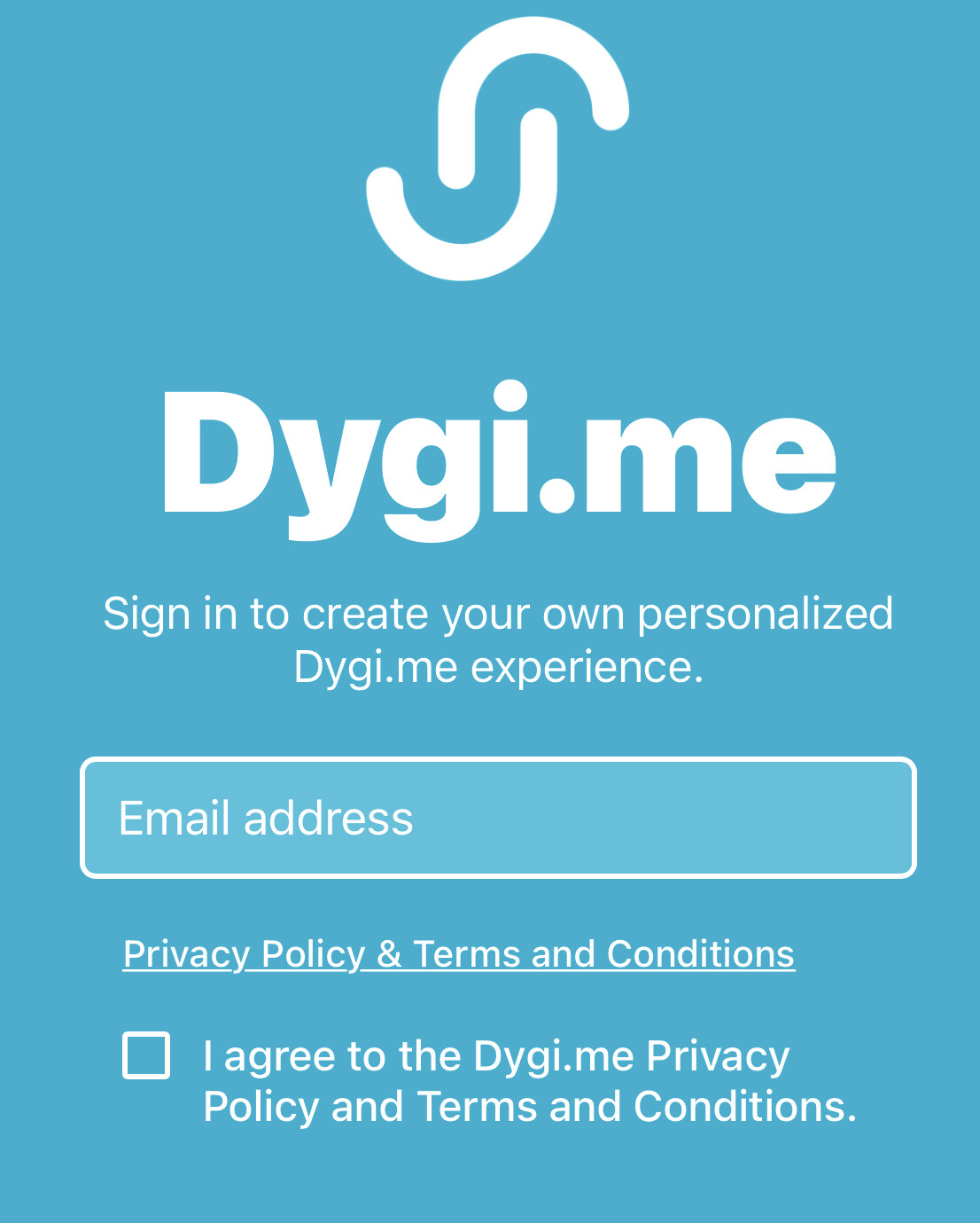
When I see the ‘progress dots’ on the front screen I automatically think ‘if I swipe the screen I will see more’ but I don’t.
So then I wonder is there is a bug or if the app is broken as I can’t swipe.
Maybe only show the ‘dots’ once onboarding starts?
The ‘dots’ are also a bit misplaced on my iPhone. This is what I see ![]()
@Robert_Petitto you are picking up personal information so where do you intent to tell the user about their rights in relation to that? People from Europe might sign in - and then you need to comply with GDPR.
@Rosewebstudio absolutely right. Didn’t notice.
Graphically good, inspiring. 
Nice page by page but i wonders why you didn’t use the swipe .
To me the css was not working (I’m using an Android tablet)
Suggestions
I would try to use nice images/icons instead on buttons at the end (with an inline list)
I would give the opportunity to share/download a file with all info (like an electronic business card).
Well done!
Nice catch on the CSS…I’ll adjust.
Ion the text box below the word “choose wisely”. I’ll make this more obvious.
Can you send over a screenshot of what it looks like on your end using the android tablet?
Oh weird. The CSS is hitting the edit screen on a tablet. Thank you…I’ll look into it.
Nice job! Like others have said above, not a huge fan of the sign up design with the progress dots. Appears they are fixed to the background so if you scroll they look weird just staying there.
Curious how you got the deep link to generate a shortened url automatically? Also do you fear that the deep link could change if you modify the app and thus breaking all the shortened links? How do you prevent this from happening or automatically refresh the shortened link with the new deep link?
Thanks for the feedback. I plan to redesign the onboarding screens today. As for the deep links, they shouldn’t change once created. The app is literally a two-screen, one-table app so I’m not worried about it.
How old is your tablet? Looks like it may not have the latest Unicode, so it can’t render the dot. I’ve ran into this, depending on the device, especially for emoji that have been released more recently. In this case, I don’t think it’s a CSS issue.
Try refreshing and launching the edit screen again on tablet…I think I fixed the strange two-column layout.
Congrats! This is a cool concept to build with Glide!
I also see the dots “behind” everything as I scroll (on iPhone)…but not too big of a deal…however the idea of using three different static images/visibility conditions per screen might work if you want to keep this UI; example:
Screen 1: blue dot, light blue dot, light blue dot
Screen 2: light blue dot, blue dot, light blue dot
Screen 3: light blue dot, light blue dot, blue dot
Might be too tedious a task, but also might keep your original onboarding UI present 
I would have to agree that the swipe layout could be kind of cool…dunno what it is about swiping that has us humans so amused haha
As for adding links and colouring the buttons to reflect the channels branding (Twitter blue, tiktok black, etc.) - I’ll assume this was this done with CSS?
Would you consider adding a “Contacts” or “Followers” UI/UX to this so that anyone who scanned your qr code could then be added to a “Contacts” or “Followers” tab/table, and vice versa?
Just my 22 cents  congrats on the launch!
It might be CSS, but I think you can achieve the same thing background-wise using dummyimage for dynamic background colors, or the new plugin column to generate an image from a hex.
Still? I removed the CSS that locked the dots in place and rearranged the placement of the progress dots this morning.
I’ll consider it…the problem is that swiping would require a new table altogether and then data is living in two places (if even temporarily).
Sure was!
I have this, but it’s a manual button push because the deeplink itself can’t trigger an action to add follower.
Your feedback is appreciated!