i want a graph whiich look like this 
so in above image there is two line which one is blue and other is pink but in other screen it is showing like 
and i have done the mapping correct
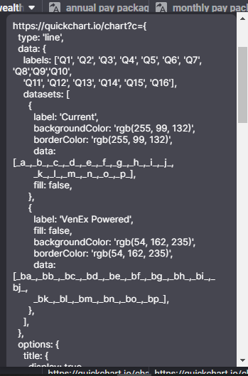


please help me how to fix this
Are you sure you have done the mapping correctly? Why is your supposed to be blue line showing in pink?
And why are your columns not given a name?
after fiving column name it will work??
*giving
No it won’t, I’m just asking why don’t you give your column names to manage it better? There’s a chance you may miss something if you don’t give them names, especially with a structure requiring so much data like this.
i checked thrice it is mapped correctly i am facing this issue from 2 sep can you please help
I would plug that template into Quickchart’s sandbox, replace the values manually there, then check the resulting graph to make sure it is completely true.
Your way of doing it here is not what I usually do. I usually have just the configurations part in the template, the URL construction part should be done in a construct URL column.
oh, my…
Are you really using 100+ unnamed columns as your data source?
That’s going to be an absolute nightmare to maintain. What will happen when you need to add more data points? More columns?
The one big thing that screams at me when I look at that is that your data should be in rows - not in columns. Then instead of 100 or more replacement values, you would just have one: which would be a joined list of all rows.
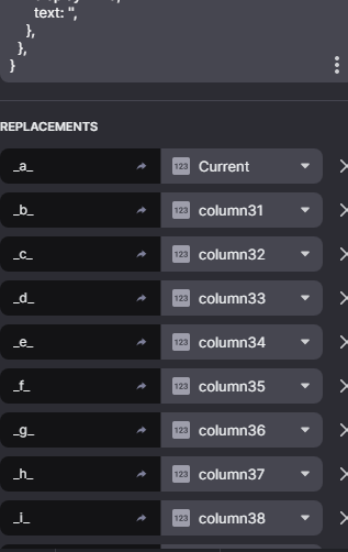
Just to give you an example, I do lots of charts like this. Here is what my template column typically looks like:
In the above template, I have just 3 replacement values:
{labels}: a joined list of the chart labels (x-axis){supply-data}: a joined list of values for my first set of data points{box-data}: a joined list of values for my second set of data pointsThe resultant chart looks like this:
The important point that I’m trying to make here is that it doesn’t matter if I have 10 data points in the chart, or 1000 data points - there will always be just 3 replacement values in the template.
One thing that I’m noticing is a lot of hanging commas. There’s a lot is places where the list of attributes end, but there is another comma, like it’s expecting another attribute. Hard to say if that’s the problem though. The only way I would be able to tell is if you copied and pasted the full text of the resulting template here in the forum. It’s hard to determine for sure with just a screenshot.

