Template + Quickchart.io inconsistency

Dear Glide Community,

I start using a lot QuickChart.io to create nice and customizable chart in my app but I’m facing some strange bug or situations.

First when I generate the “template/API” through quickchart.io the result is not very easy to use because a lot of % and extra data/letter are added like below. Is it possible to remove them or clean the result ? FYI, I’m able to use it despite the format but I’ll looking for something cleaner.
Second question, I don’t understand why sometime some data are not replaced in my glideapp through the template ? Usually I sub the data in this template by #, ##, ###
In the example below the data 77 is sub by # but in my app for some player/user it is not working ( I noticed that it happens only for some data without rounded number but not everytime). Is it a quickchart.io bug ? a spreadsheet bug ? a glide table/template bug ? or I’m the bug :slight_smile:

https://quickchart.io/chart?c={ %20%20"type"%3A%20"horizontalBar"%2C %20%20"data"%3A%20{ %20%20%20%20"labels"%3A%20[ %20%20%20%20%20%20"Serve%2FService"%2C %20%20%20%20%20%20"Set%2FPasse%20Haute"%2C %20%20%20%20%20%20"Bump%2FManchette"%2C %20%20%20%20%20%20"Spike%2FSmash"%2C %20%20%20%20%20%20"Block%2FContre"%2C %20%20%20%20]%2C %20%20%20%20"datasets"%3A%20[{ %20%20%20%20%20%20data%3A[77%2C%2022%2C%2033%2C%2044%2C%2055]%2C %20%20%20%20%20%20backgroundColor%3A%20[%20 %20%20%20%20%20%20'rgb(66%2C%20133%2C%20244)'%2C %20%20%20%20%20%20'rgb(219%2C%2068%2C%2055)'%2C %20%20%20%20%20%20'rgb(244%2C%20180%2C%200)'%2C %20%20%20%20%20%20'rgb(15%2C%20157%2C%2088)'%2C %20%20%20%20%20%20'rgb(180%2C%20180%2C%20180)'%2C%20]%2C %20%20%20%20}] %20%20}%2C %20%20"options"%3A%20{legend%3A%20{%20display%3A%20false%20}%2C %20%20%20%20"responsive"%3A%20true%2C %20%20%20%20"title"%3A%20{ %20%20%20%20%20%20"display"%3A%20false%2C %20%20%20%20%20%20"text"%3A%20"Chart.js%20Bar%20Chart" %20%20%20%20}%2C %20%20%20%20"plugins"%3A%20{ %20%20%20%20%20%20"roundedBars"%3A%20true%2C%20 %20%20%20%20} %20%20} }

The real code is =

{
“type”: “horizontalBar”,
“data”: {
“labels”: [
“Serve/Service”,
“Set/Passe Haute”,
“Bump/Manchette”,
“Spike/Smash”,
“Block/Contre”,
],
“datasets”: [{
data:[77, 22, 33, 44, 55],
backgroundColor: [
‘rgb(66, 133, 244)’,
‘rgb(219, 68, 55)’,
‘rgb(244, 180, 0)’,
‘rgb(15, 157, 88)’,
‘rgb(180, 180, 180)’, ],
}]
},
“options”: {legend: { display: false },
“responsive”: true,
“title”: {
“display”: false,
“text”: “Chart.js Bar Chart”
},
“plugins”: {
“roundedBars”: true,
}
}
}

Thank you in advance for your help or advice

You can use a tool like this to decode the url.

https://www.webreload.de/url-encoding/

3 Likes

Thank you very useful to decode the quickchart.io link generated …it is now very easy to use and modify to include inside glideApp Template functionality…but unfortunately it didn’t improve the issue with some data in my chart.

Thank again

Can you elaborate on this? What is the error that Quickchart returns when they generate these cases?

Are each of your template replacement variable names unique? (they must be to work properly).
Can you show what your template column definition looks like?

Also, you may find the Construct URL column useful when you have complex chart definitions. See example of how to use it :arrow_down:

2 Likes

Hi Darren
Thank you for taking the time to answer me. I create a video to show my situation. For the URL column I’m sure to have the need of that and to understand exactly how to use it (I’m pretty new in glide apps and “coding”) => Loom | Free Screen & Video Recording Software
I have also some strange bar (triangle) that appears for some data (see attachment) so it is strange I also reached Support@quickchart.io and they are looking on their side also.
Untitled

Hi,
Thank you for your help. Quickchart returns blank/no data bar or a “triangle”
See my video => Loom | Free Screen & Video Recording Software
and the screenshot attached Untitled

Can you get a copy of the template column value after it’s ran through the replacements, and post the url here? Just want to make sure all of the replacement values worked correctly.

Sorry I’m sure to understand what you want me to share with you below the template inside the template column

https://quickchart.io/chart?c={
  "type": "horizontalBar",
  "data": {
    "labels": [
      "Serve/Service",
      "Set/Passe Haute",
      "Bump/Manchette",
      "Spike/Smash",
      "Block/Contre",
    ],
    "datasets": [{
      data:[_#_, _##_, _###_, _####_, _#####_],
      backgroundColor: [ 
      'rgb(66, 133, 244)',
      'rgb(219, 68, 55)',
      'rgb(244, 180, 0)',
      'rgb(15, 157, 88)',
      'rgb(180, 180, 180)', ],
    }]
  },
  "options": {legend: { display: false },
    "responsive": true,
    "title": {
      "display": false,
      "text": "Chart.js Bar Chart"
    },
    "plugins": {
      "roundedBars": true, 
    }
  }
}

That still has the # values that need to be replaced. I was hoping to see the result of the template after the # values have been replaced with actual data. I’m just trying to verify that the # values on the data block were replaced correctly.

Also when you post code like that be sure to use four backticks ```` before and after the url so it shows up correctly in the forum. You should also be able to highlight the url and click on the code block button </> so no additional formatting is applied by the forum and it shows exactly how you pasted it.

2 Likes

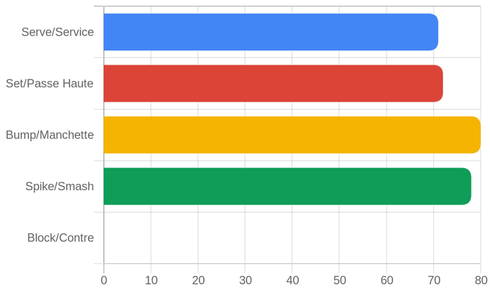
Ok thank you for the advices about the forum. I hope I did well because I think I understood what you were asking me. So below the url to the quickchart generated inside my app after the template ran with my data. In this example a blue serve/service horizontalbar should be shown with 71 as data but it is not the case.

https://quickchart.io/chart?c={%20%20%22type%22:%20%22horizontalBar%22,%20%20%22data%22:%20{%20%20%20%20%22labels%22:%20[%20%20%20%20%20%20%22Serve/Service%22,%20%20%20%20%20%20%22Set/Passe%20Haute%22,%20%20%20%20%20%20%22Bump/Manchette%22,%20%20%20%20%20%20%22Spike/Smash%22,%20%20%20%20%20%20%22Block/Contre%22,%20%20%20%20],%20%20%20%20%22datasets%22:%20[{%20%20%20%20%20%20data:[71,%2072,%2080,%2078,%20],%20%20%20%20%20%20backgroundColor:%20[%20%20%20%20%20%20%20%27rgb(66,%20133,%20244)%27,%20%20%20%20%20%20%27rgb(219,%2068,%2055)%27,%20%20%20%20%20%20%27rgb(244,%20180,%200)%27,%20%20%20%20%20%20%27rgb(15,%20157,%2088)%27,%20%20%20%20%20%20%27rgb(180,%20180,%20180)%27,%20],%20%20%20%20}]%20%20},%20%20%22options%22:%20{legend:%20{%20display:%20false%20},%20%20%20%20%22responsive%22:%20true,%20%20%20%20%22title%22:%20{%20%20%20%20%20%20%22display%22:%20false,%20%20%20%20%20%20%22text%22:%20%22Chart.js%20Bar%20Chart%22%20%20%20%20},%20%20%20%20%22plugins%22:%20{%20%20%20%20%20%20%22roundedBars%22:%20true,%20%20%20%20%20}%20%20}}

in this second example the issue is the red set/passe haute category should show 78 but it not the case and in addition the green spike/smash category should be blank because the data is 0 for this player but it shows a green triangle

https://quickchart.io/chart?c={%20%20%22type%22:%20%22horizontalBar%22,%20%20%22data%22:%20{%20%20%20%20%22labels%22:%20[%20%20%20%20%20%20%22Serve/Service%22,%20%20%20%20%20%20%22Set/Passe%20Haute%22,%20%20%20%20%20%20%22Bump/Manchette%22,%20%20%20%20%20%20%22Spike/Smash%22,%20%20%20%20%20%20%22Block/Contre%22,%20%20%20%20],%20%20%20%20%22datasets%22:%20[{%20%20%20%20%20%20data:[100,%2075,%2078,%20,%20],%20%20%20%20%20%20backgroundColor:%20[%20%20%20%20%20%20%20%27rgb(66,%20133,%20244)%27,%20%20%20%20%20%20%27rgb(219,%2068,%2055)%27,%20%20%20%20%20%20%27rgb(244,%20180,%200)%27,%20%20%20%20%20%20%27rgb(15,%20157,%2088)%27,%20%20%20%20%20%20%27rgb(180,%20180,%20180)%27,%20],%20%20%20%20}]%20%20},%20%20%22options%22:%20{legend:%20{%20display:%20false%20},%20%20%20%20%22responsive%22:%20true,%20%20%20%20%22title%22:%20{%20%20%20%20%20%20%22display%22:%20false,%20%20%20%20%20%20%22text%22:%20%22Chart.js%20Bar%20Chart%22%20%20%20%20},%20%20%20%20%22plugins%22:%20{%20%20%20%20%20%20%22roundedBars%22:%20true,%20%20%20%20%20}%20%20}}

In the first example, the serve/service isn’t showing up because the leftmost boundary is 71, hence, you’re not seeing the value.

Comparing your code with this one, I can’t tell what’s missing.

2 Likes

Below are both of your links decoded and corrected and the resulting charts. This first thing that jumped out to me was the incomplete data. You had five sets of data, but the first chart only had 4 numbers filled with 1 blank and the second chart only had 3 numbers filled with 2 blank. I think at a minimum, you should have a zero instead of a blank for a number.
data:[71, 72, 80, 78, ] → data:[71, 72, 80, 78, 0]
data:[100, 75, 78, , ] → data:[100, 75, 78, 0, 0]

@Robert_Petitto made a good point on the chart showing the minimum value as the lowest data value, so whichever is lowest will not produce a bar. To fix that you need to set the scales to start at zero. I have corrected both urls with the correct scale and a full set of data. Hopefully that gets you closer to your end result. Depending on what you want, you may need to set a maximum for the scale as well.

Here’s the first link decoded:
`https://quickchart.io/chart?c={ “type”: “horizontalBar”, “data”: { “labels”: [ “Serve/Service”, “Set/Passe Haute”, “Bump/Manchette”, “Spike/Smash”, “Block/Contre”, ], “datasets”: [{ data:[71, 72, 80, 78, 0], backgroundColor: [ ‘rgb(66, 133, 244)’, ‘rgb(219, 68, 55)’, ‘rgb(244, 180, 0)’, ‘rgb(15, 157, 88)’, ‘rgb(180, 180, 180)’, ], }] }, “options”: {legend: { display: false },

“scales”: {xAxes: [{display: true, ticks: {suggestedMin: 0, beginAtZero: true} }] },

“responsive”: true, “title”: { “display”: false, “text”: “Chart.js Bar Chart” }, “plugins”: { “roundedBars”: true, } }}`

Here’s the second link decoded:
`https://quickchart.io/chart?c={ “type”: “horizontalBar”, “data”: { “labels”: [ “Serve/Service”, “Set/Passe Haute”, “Bump/Manchette”, “Spike/Smash”, “Block/Contre”, ], “datasets”: [{ data:[100, 75, 78, 0, 0], backgroundColor: [ ‘rgb(66, 133, 244)’, ‘rgb(219, 68, 55)’, ‘rgb(244, 180, 0)’, ‘rgb(15, 157, 88)’, ‘rgb(180, 180, 180)’, ], }] }, “options”: {legend: { display: false },

“scales”: {xAxes: [{display: true, ticks: {suggestedMin: 0, beginAtZero: true} }] },

“responsive”: true, “title”: { “display”: false, “text”: “Chart.js Bar Chart” }, “plugins”: { “roundedBars”: true, } }}`

4 Likes

thank you so much @Jeff_Hager and @Robert_Petitto for your help and analysis about my issue. It is now fixed. The issue were the 0 not present in my spreadsheet columns and also the axis scale not starting at 0. Now it is working nicely so thank you so much for taking the time to help me. By the way, support at @quickchart.io was also pretty amazing and very reactive/helpful.

1 Like

Hi guys,

To follow this discussion and the use of quick chart inside Glide.
I received a question I’m not able to answer from Ian (support@quickchart.io) asking if Glide is able to manage encoding URL in the specific case below. Currently this specific chart is working on quickchart.io or on a regular browser but not as a glide template.

The quote from Ian Webster

‘This is almost certainly happening because the chart portion of the URL needs to be URL-encoded. Wonder if there’s a way to do that in Glide?’

The difference between a regular quickchart graph is this part of the code below

‘formatter: (value, ctx) => {
// Array of visible datasets
let datasets = ctx.chart.data.datasets.filter(ds => !ds._meta[0].hidden);
if (datasets.indexOf(ctx.dataset) === datasets.length - 1) {
// This is the last visible dataset of the bar
let sum = 0;
datasets.slice(1).map(dataset => {
sum += dataset.data[ctx.dataIndex];
});
return sum.toLocaleString( /* … */ ) + ’ hits’;
}’

A picture of the real chart expected in glide but not possible when data are pushed through a template.
Capture5

A picture of the result in glide when the quickchart link is use as a template

Any thoughts or answers to return to Quickchart ? It is definitely over my capacities and they are interested by the glide answer…

Thanks

You could try it with a Construct URL column. Below is an example of how to use that.

5 Likes

Oouah ! thanks @Darren_Murphy
I was so afraid to try this but it worked perfectly and it was so easy to set-up. The result is amazing and exactly what I was looking for.
The glide community rocks another time. I’m going to answer and show the results to Ian at Quickchart.io support.

Capture4

3 Likes

Glad you got it working. Ian has been very supportive of the Glide community :+1:

3 Likes

That’s beautiful. Glad you got it worked.

2 Likes

Hey I’m trying to include a Quickchart in my app, but when I copy the JSON from the Quickcharts sandbox into a template column and implement using the Construct URL method described above - I see the chart but not the “Options” and “Plugins” features from the JSON - so basically the quadrant background shading and annotations don’t show.

It’s this chart: here

Any idea why that might be? Is glide somehow splitting the JSON?