Today Glide announced a new update to the titles component. I understand it’s important to keep the Glide Layout page simple enough for the average user to quickly whip up pages. And overall, the Glide layout interface and options are really good.
However, I think we’ve gone too far on the “simple” side.
I’m requesting we bring back the flexibility we had before with the original titles (small, medium, large, etc.).
When this update was implemented, it made all of the pages in my app look out of wack because the headings were either too large or too small.
For example, titles in edit and form popups are too big now, and the subtitle text no longer supports line breaks, as you can see here:

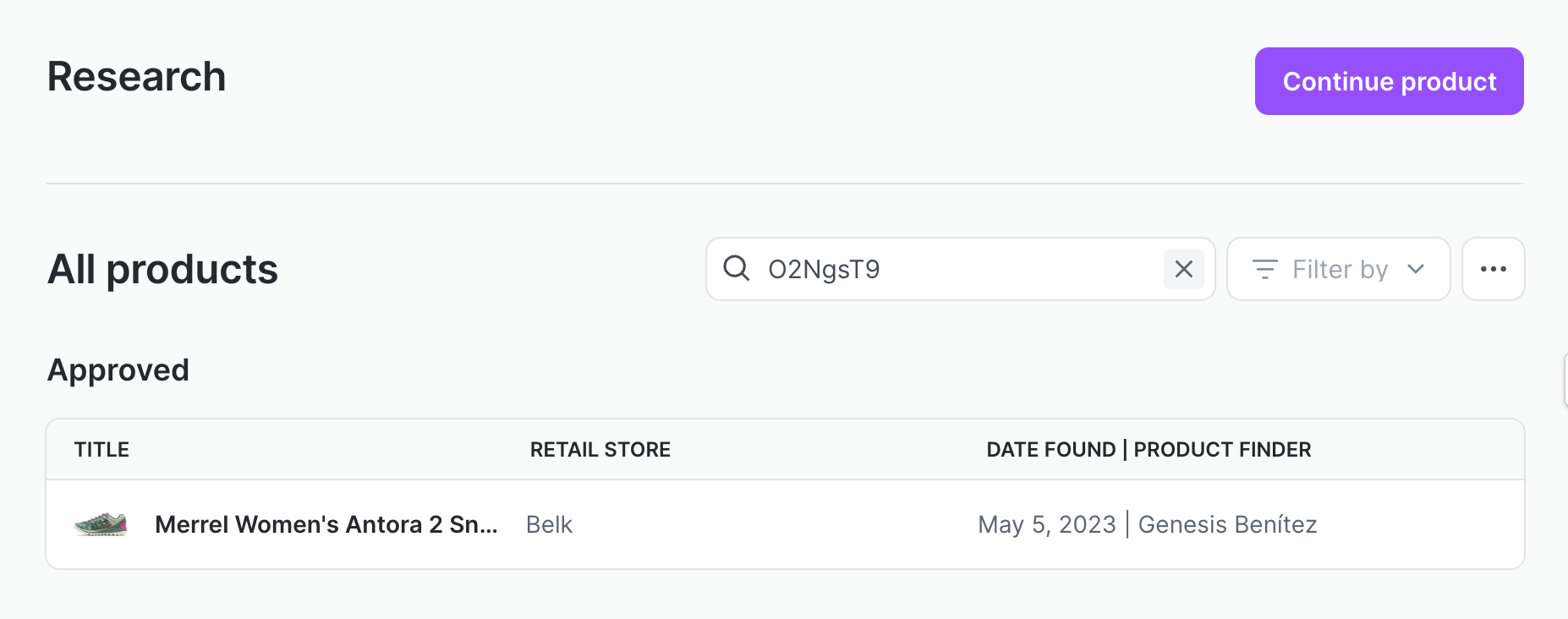
And the titles on pages are either too small or too big. You can see that my title on this page (“Research”) is now way too small. Before the update it looked much better.
We should be able to make titles that are bigger than the titles of collection components.
I know there is the option of headings, but titles look much better as the official title for a page, and they’re more convenient because I can attach actions to them.
Everyone, let me know if you have any thoughts on this.
(cc @tristan)

