Hello! Trying to get two choice buttons to be side by side. How can I make that happen?
Thanks!
In desktop mode you can use a two column container, but they would still stack up in mobile view.
I’m not aware of any way to do that in mobile view.
For mobile layout what you could do is use a custom collection on top of a 2 row helper table.
Label the rows in the helper table row 1 and row 2 and add two choice components inside your custom collection.
On the first choice component apply the visibility condition when helper table row -> equals -> 1… and for the second… when helper table row -> equals -> 2
Here is an example where I used this method with date pickers on mobile.
Bonjour,
Pouvez-vous préciser ou trouve-t-on une table d’assistance à 2 lignes svp?? Et comment étiqueter les lignes de la table d’assistance svp?
Merci beaucoup
Nice workaround. Thanks for sharing!
You’ve got both components in the left hand column. Drag one of them down to where it says “+ Insert Component”
Thank you for that.
Truly appreciate the help!
Could you possibly attach the screen(s) showing your configs for this setup? Afraid I’m not following when you say ‘helper table row’
Create a new table with exactly 2 rows (helper table)
Add a basic column in the new table (let’s call it ID) and put 1 in the first row and 2 in the second row.
Add a custom collection (Layout Grid - Size Medium) to your screen where the Source of the custom collection is the new 2 row table.
Put two choice components inside the custom collection… set the visibility condition of the first component when column ID = 1. And for the second component when column ID = 2.
FYI this trick doesn’t work with all components… but it works well with date picker, choice, and big numbers to name a few.
Thanks so much for quick response, Eric!
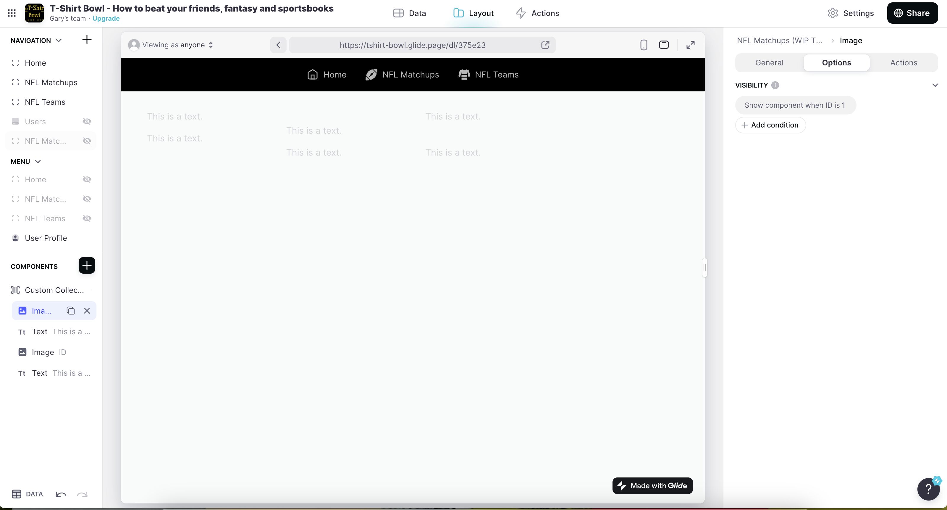
Pardon my density. Maybe I’m running into an example where it doesn’t work for image components. That said, I can’t seem to make it work with any kind of component (you see I’m testing with both image and text components.
I’ve set up the 2-row, 1-column helper table (see attached)
I’ve set up the Layout Grid at Size Medium (see attached)
I’ve set the visibility as described.
But seems I’m still missing some steps?
Ya my trick doesn’t work with those components and is a workaround specifically for mobile view. I see three rows in your helper table (possibly more)… you need exactly two rows… no more no less.
I also see the desktop view in your screenshot… for that your destiny is easy.
Start over and add a container to your screen. choose a layout design with multiple sections. Add components to them. That should do it 

Sorry for the confusion; I attached an image with the desktop preview above. Here’s the mobile preview now below.
My hurdle is getting two images to appear side-by-side on mobile. I would like to force them to be side-by-side somehow with other components (buttons) underneath each. I can easily achieve this on desktop like so (T-Shirt Bowl - How to beat your friends, fantasy and sportsbooks), but I cannot figure out how to force a two-column layout on mobile without the columns stacking responsively by default.