Hi All, Is there a way to get the choice component to appear as it does when it’s being selected.
See below for explanation of how choice appears when it’s being Selected vs how it appears once live.


Hi All, Is there a way to get the choice component to appear as it does when it’s being selected.
See below for explanation of how choice appears when it’s being Selected vs how it appears once live.
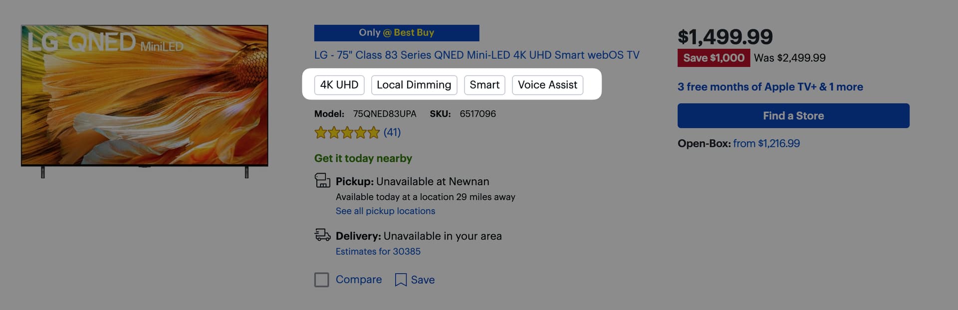
I understand you’re saying…ultimately, you’d like a read-only (clickable?), “chip” style display of what was chosen… very popular in commerce websites like Best Buy:
This would be awesome. There’s no great way to do this in Pages yet (@Ivo_Elbert we need this), but in Apps, you can get away with something like this:

This is exactly what I need for apps Robert, thank you! I was looking on Youtube but missed this before somehow.
Just know that this solution leverages a spreadsheet formula and is not the most efficient way to do this nowadays (I need to recreate the video I guess), but it will at least get you up and running!
Working on something. Top is CSS styled DIV tags created from a joined list column. Bottom is a choice component. Not overly complicated, but edging on overkill. Might end up making a single javascript column do handle it.
Also, these are not clickable, so only useful if you just want a bunch of tags generated from a comma delimited list.
Nice for static display! Clickable would be awesome…but not possible with CSS alone.