This is wonderful!! =]
What about adding colors for the badges 
And fireworks
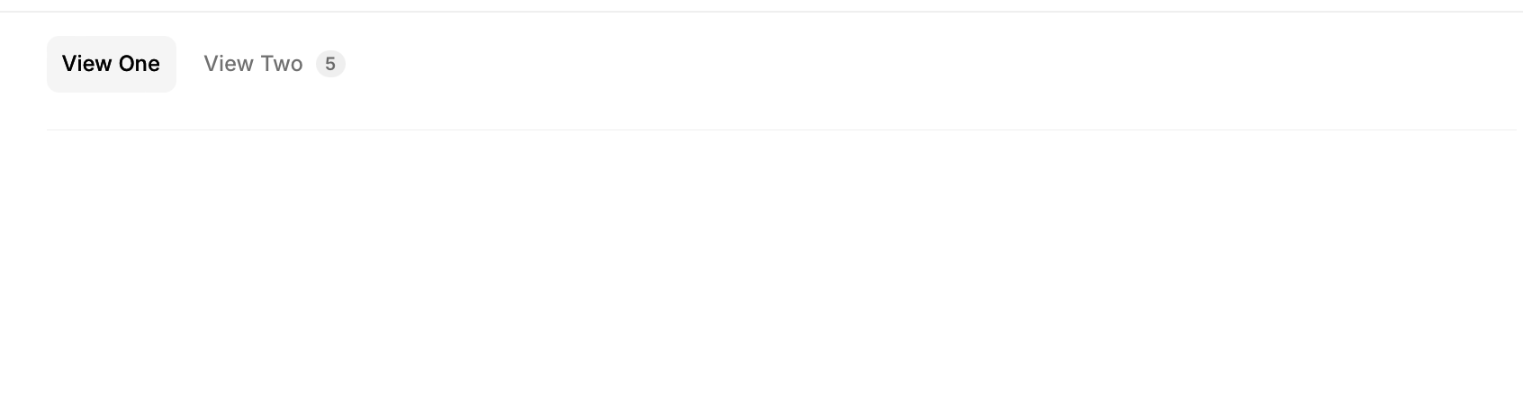
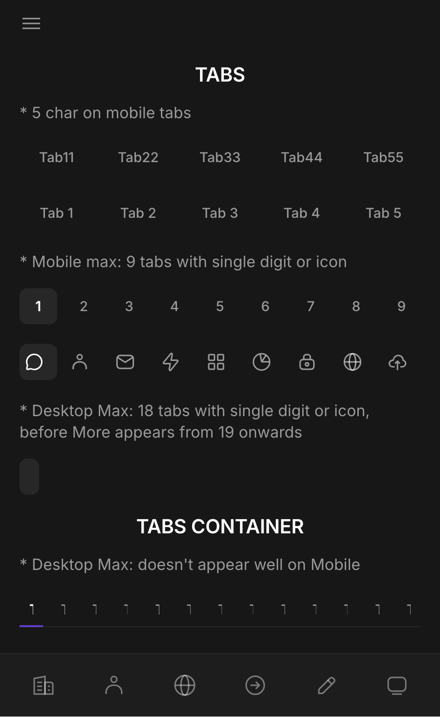
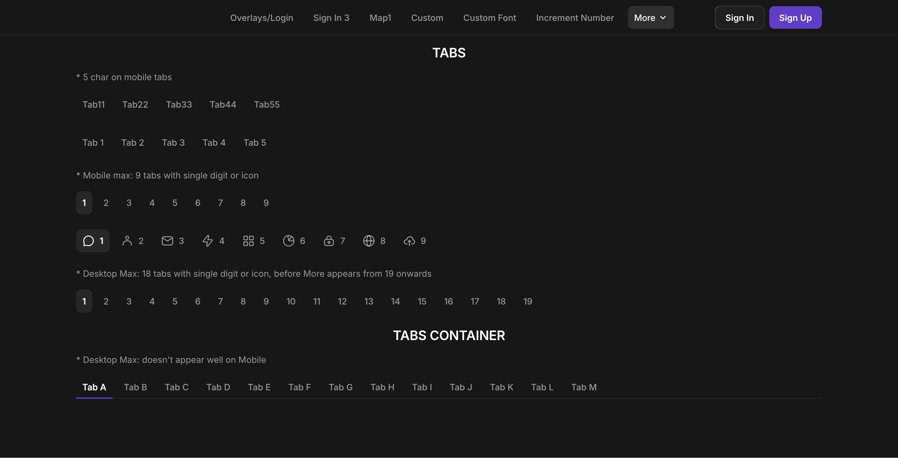
 The very first and most obvious feature is the default tab.
I mean the tab container.
Love this… thank you Glide! Can you quickly explain how the user’s selected tab gets written to the column in the user table…?
Not sure if I get you right here, but you have the option to select a column to save the selected tab to, just like a choice component. But it only works for the Tabs component, not Tab Containers.
Yes, the tab component works almost like the old swipe (linked to a column)—it’s what I used when converting a classic app with swipe (RIP). The only issue is that Glide will likely adjust its style for wider screens. For now, its size stays the same regardless of screen size, so it looks small on larger displays.
It would be great to have the option to make the tabs themselves sticky, so they don’t disappear off the top of the page when scrolling on longer pages!
Post a Feature Requests !
If you have access to CSS, put the tab inside a container, name the container’s class “sticky-top” (or anything that you want), and use this:
.sticky-top {
  position: -webkit-sticky;
  position: sticky;
  top: 0px;
  z-index: 999;
  margin-top: 0px;
}
Exciting to see the Tabs Container and Tabs Components entering public preview—this adds a much-needed layer of UI flexibility for modular content presentation. If you’re building dashboards, forms, or multi-step workflows, these components can significantly improve usability.
A few observations and tips:
- Tabs Container serves as the wrapper, managing layout and switching logic. It’s clean and intuitive, especially when working with dynamic or conditional tab visibility.
- Tabs Components allow for granular control of content in each tab—ideal for segmenting user input, configuration pages, or data views.
- Early tests show good responsiveness across screen sizes, and performance seems stable even with multiple nested components.
- It would be great to see custom styling support and tab state persistence in future updates, especially for SPAs or apps with session-based navigation.
If anyone has explored deeper integrations (e.g. binding tab state to URL params or using it with complex data forms), I’d love to hear your approach!
Both components are working very well! Still wish we could have custom collections within another collection / container, but for now this helps a lot!

For me I cancelled all the icons because of the same issue, kept it short, 1 word only.
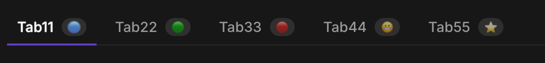
Two other styling issues I noticed that I hope will be addressed: The badge icon really doesn’t show up very well even against a card or highlight background. But it (along with the button styling) get completely lost against a dark or accent background.
Plain background:
It would be nice to be able to set a different color other than light gray.
These are “buttons” but the outline is lost as is the background for the badge.
An toggle for vertical tabs would be great for desktop!
The tabs container is great, it just needs the same width setting as a regular container - otherwise everything needs to be max width.

This is so great! Nested containers would be the next logical step.