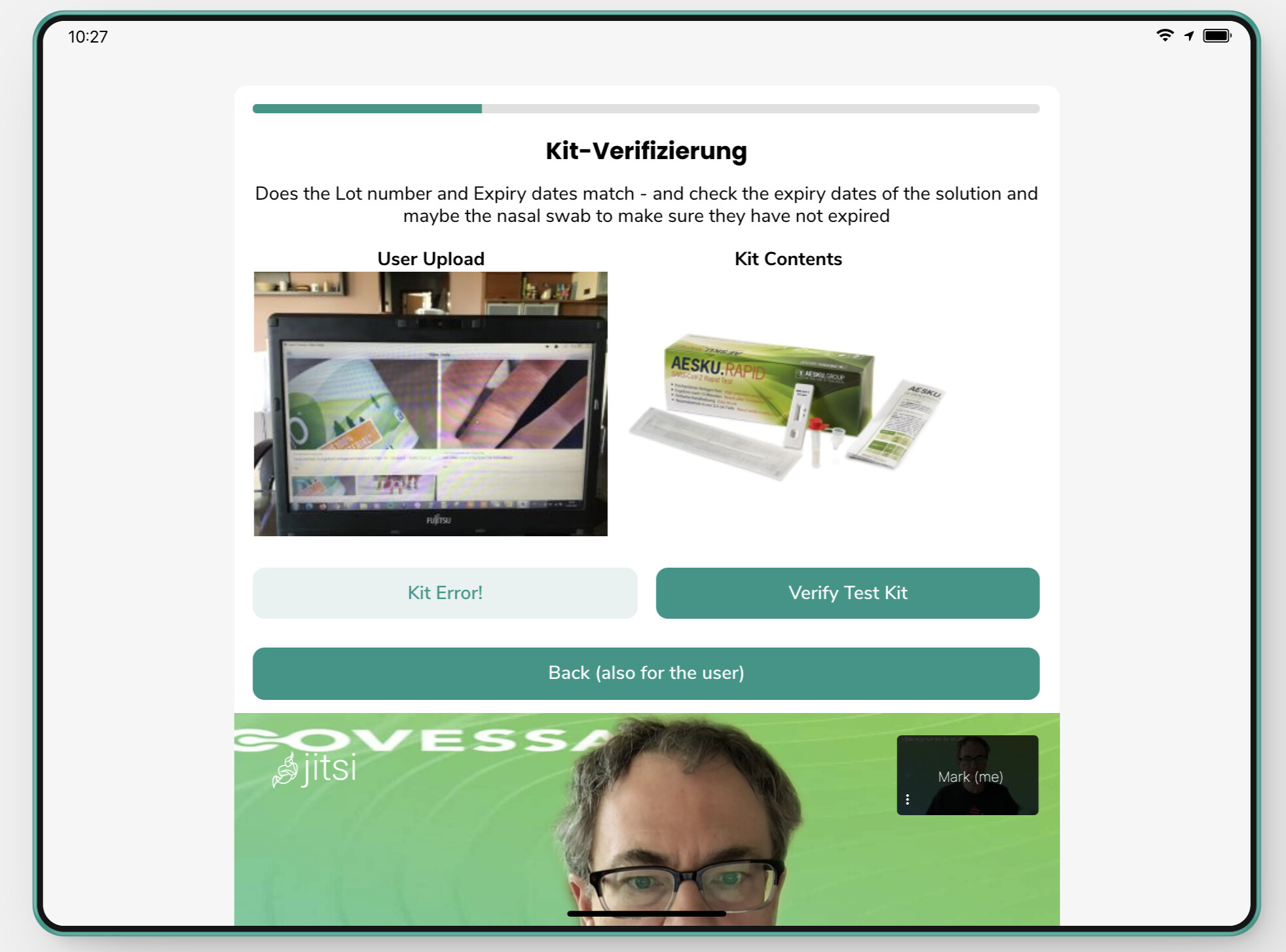
the issue then becomes screen real-estate — on the screen, you want the user attention to be maximized in the important parts, and reduce scrolling.
I also have the desktop view set up for the agents - which means some things look really big 

The table approach offers the best compromise for this use case. I will keep the other tricks in mind for future features and projects though. Thanks!
