Selecting options from X/Y query outputs

I am stumped… I believe @Jeff_Hager addressed a very similar question in this thread, but I just can’t find my way over the wall. I feel bad about raising the same question again.

Imagine a hub & spoke network. I have a number of devices [Column A] deployed in locations all around the wheel. There are a number of routes [Columns D - W] available for those devices to connect to, but they can only choose 1 per device.

The app users define both the paths and deployment of devices, so both are variable lists collected from Glide Forms and massaged with Queries, etc.

I’m stumped as to how to present those options for users to choose from. I can transpose the Rows into columns, but then I’d have to have dynamic column headers because the devices are a dynamic list and the names could be anything.

I’m not concerned about which COMPONENT gets me there: It can be a drop down, can be a check box, can be tile selection. I would just like to understand how to do this, and I’ll worry about the aesthetics later.

I have taken the time to create a sample sheet for the sake of simplification, but you can also just look at this screen shot. Dark Gray is the Y-axis that drives the LIST in my Glide Tab. Light Gray is the X-axis associated with Col1, that users need to choose from. Red text indicates there’s a Query in that cell.

Thanks in advance! I look forward to giving back to this community as I get better at this.

1 Like

There is quite a long post about filter choices here

and the post

This post as an example of doing just one level

If this is not what you were looking for let me know

Thanks Gary. Robert’s video is an eye-opener (as usual). I hadn’t found that yet.

As for your other thread, I started to re-create your Boat rental scenario a few days ago, but had to drop it, when I couldn’t make sense of things.

Appreciate your input. I’ll delve into this over the weekend.

On the weekend I will see if I can pair down the app and the spreadsheet to something simpler than the 50 columns, 300 rows and 12 tabs it currently is. Something that just shows the chooser and how to set the spread sheet data up.

Poke me if there is no response by Monday evening.

A thought…

What if you were to re-structure the query output in pf_3, such that everything was contained in 2 columns (UMID, Options). You could then present the Options column in a choice component, using the UMID as a filter.

Would that work?

1 Like

I am not sure what the user has to choose in the interface. Is it this? User chooses a Device, Location, and UMID and then you present them options 1,2,3,… to pick from in a choice?

To just present options 1,2,3 in a chooser do this:

  1. In the glide data sheet these will be shown as only one column called option
  2. For a chooser you need to turn that into rows by using a relation in the glide data sheet
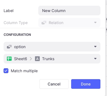
  3. Create a sheet with just the trunk names Say “Sheet6” in the spreadsheet, column name “Trunks”, not sure if this has to be a sorted list (I did try it on the Label column in pf2 but that brings in the whole row and gets messy)
  4. Add a relation column the glide data sheet called say “New Column” as shown below

Untitled

  1. Now point the choice component to this, like this

  1. choosing a value puts it in choice column of pf4

I do have an app running against a copy of your spread sheet now if you want it let me know and I will try to figure out how to let you get a copy. If this is not what you wanted then let me know.

BTW that is a pretty fine spreadsheet - I had no idea one can do sql calls on the sheets.

Actually, the user will navigates to a DETAIL page that is specific to a DEVICE (row on pf_4). That Device has a LOCATION as it’s primary attribute (forget about the UMID, that’s just how I protect against duplicate device names from sloppy users). The choice COMPONENT should offer only the relevant options, as determined by the back-end work in the Google Sheet (a single row in pf_4).

By following Robert’s example you linked to above, I got it working for viewing, but I’m wrestling with how to write a selection from one of the filtered choices.

I’ve simplified it a bit as a stepping stone:

I made a list of locations with their associated Trunk Lines (Sheet7)

I then created an INLINE LIST component displaying elements (Trunk Lines) from pf_1. And I added the Choice component and Single Value column per Robert’s filtering demo. It looks like this:

And rightfully results in this:

Screen Shot 2021-02-13 at 10.25.55 AM

The challenge for me (not you :smiley:) now is to let the user select one of those resulting values (Trunk 394 or Trunk 396, in this example) and associate it with one of the devices from Column B in pf_2. Then stuff the resulting selection into one of the tables, to form the association:

DEVICE CHOICE :left_right_arrow: PATH OPTION (aka trunk #)

I feel like I’m getting closer - thanks for your help.

1 Like

I don’t think that would work because there are multiple Options for each UMID/Device (those are interchangeable terms see below). Each UMID needs to show an association to N-number of Options. The associations are formed by the LOCATION.

Thanks for your feedback. I’m chipping away at it. The problem is mine to solve, and by no means should you get sucked into this hole! But for the curious :nerd: here’s an overview:

Here’s how it works. The Trunk Lines are defined by the infrastructure team, forming a topology of fiber optic cables. Each trunk line has numerous strands - but that comes later in my development.

A later team comes in and starts deploying end-point devices that need to connect to the fibers. If I send Joe to Zone 3 with a device, he’ll find he has only three paths (Trunks) that he can connect to. To form the association in the App, he could scroll through a lot of Trunk names that aren’t relevant, before choosing. And he might even choose one in the app (by mistake) that doesn’t exist in Zone 3. To avoid those errors, I want to show him only the Trunk lines that pertain to the Zone he’s working in. Of course, there will be multiple users working in multiple locations simultaneously, and in the end, they’re connecting to each other, so the App streamlines operations. Or it will.

Once I understand how to build this mechanism in Glide, I’ll further deploy it to show a user all the multiple strand choices he has on in each location’s trunk lines (ranging from 12-72 per Trunk line). And from that, I’d like to show him only the strands that are as-yet unassigned.

This is just one mid-level component of the App. I’ve already got the infrasture portion built (managing the fiber device deployment, with some basic resource management). Once the devices connection layer is in place, there’s a whole other layer of signal management (each device can carry N-number of signals, depending on the model, type and configuration). And from there, “it’s just turtles all the way down.”
:turtle: :turtle: :turtle: :turtle::turtle: :turtle: :turtle:

BTW: I should have left the UMID out of my sample sheet. The device names are entered by users, and may potentially be duplicate names. So, when the user is adding a new Device via my Form, I append a Unique ID to search against in a number of lookups I have across the app.

1 Like

If you use a Choice component for the trunks you can write it to a column in the spreadsheet. That is my example above.

Do remember that in the glide sheet you can do relations to do a JOIN on the records.

Anyways you must be close now

1 Like

I have a very similar setup in an app that incorporates cascading filters. It’s configured where user choices (paths) are written to user-specific columns. Then through a series of templates (ROW ID + all options, ROW ID + all selections “locations, paths”), I relate selections back to options to derive the variant (Zone). I can elaborate on this later if it’s anywhere near what you’re working through.

Side note: I don’t imagine your P4 can be organized this way?

p4

1 Like

Some good ideas there, Rasha. I will play with the Template idea.

As for your sample table, I’m not sure if I can get that to come from a query reliably. I’ll have to give it some thought…

Thanks for the input.

1 Like

I remembered an app I was working on last year… I think this is a little closer to what you’re looking for (?) I added a path options tab to your worksheet. Admittedly, I’m not keen on having major functionality hinge on one formula but there was no other option at the time… It accounts for path options 1-6.

2 Likes

That’s it! Thanks Rasha. I think the missing link for me was where you related the Array column [Path option] to the single column equivalent of the same data set. I think I get it! But I will dig into it and really make sure I understand it.

Screen Shot 2021-02-13 at 11.01.36 PM

FWIW: I see that you concatenated all the paths, column, by column, with text join, then split them back apart to get them all into a single column. I did the same for you in Column C with the somewhat new Sheets function FLATTEN. Same result… just a lot less typing, and the resulting formula is less fragile.

=unique(sort(flatten(pf_4!D2:H10),1,1))

You get a blank cell at the top of the resulting column - which I know can be filtered out somehow, but I can’t remember exactly… I often just reverse the sort order in Sheets to put the blank at the end of the list, then reverse the sort order again in Glide to line things up the way I want them, since Glide ignores the blank cell.

Thanks for this solution - and thanks Gary for your help! I’ll post back here with anything else I learn about this. I’m always thinking of some frustrated seeker a year from now who’s trying to learn, just as I’m doing now.

Regards.

2 Likes

Glad to hear it! hmm. Not getting same results on my end. Is this the full formula to replace what I have in A2?

I should mention it was Jeff and Thinh who came up with this workaround for the inability to use array columns in choice components.

Yes, pls do post back esp if you venture into multi-choice selections.

3 Likes

Yes, that’s the whole formula. I don’t understand WHY it works, because after you provided your solution, I spent some time away from the computer thinking about it and I came to the (apparently wrong) conclusion that you have to have a 1:1 correlation between the original array and values in the column that results from your formula.

In other words, I’d convinced myself that the relation in GLIDE is doing a kind of pivot/lookup. But in fact, it’s not. My solution uses UNIQUE and SORT to completely break that correlation and the app still returns only the correct relations (I checked every single option against the the table in pf_4).

So, I don’t get WHY it works, but it does and I’m starting to implement it in my app. Once I get it a little further along, I’ll share a video.

For anyone else trying to figure this out, I’ll add some screen shots here.

2 Likes

I see why: numbers a bit different from original data set. Flatten – I like it.

Btw, can’t help but think about G. Battista Belzoni every time.

GBB is a more respectable Belzoni. I took my screen name from a Tom Waits lyric (Song title; Pony):

I walked from Natchez to Hushpukena
I built a fire by the side of the road
I worked for nothin’ in a Belzoni saw mill
And I caught a blind out on the B and O
Talullah’s friendly, Belzoni ain’t so
A forty-four will get you ninety-nine

1 Like

totally off-topic, but FWIW, turns out that Waits’ Belzoni – in Humphreys County, Mississippi – is named after Belzoni.

1 Like