Many of my users are confused by the + button. It is there to “add a new order” so I would like to label it something like “Add New” or “New Order” to indicate more explicitly what it is intended for. Is this possible? Thanks
For mobile devices, I would remove the Add option from the collection and instead add a button to the screen to open a form or open a new screen with a custom form or form container.
Yes, I am modifying an existing record. There is a record created in the DB when the order is initiated. After that, the record for that row becomes the record I am modifying (through some connection magic that is not explicit and seems darn tricky to track down).
This is what I have. A page/form that takes orders (adds items to Order Details) and then lets you modify some items on the form not related to item details. The first big button, when selected, opens a form I think using the action Show Form Screen
And has the normal Cancel and Submit Buttons. The other big button open another form that just seems to have a workflow attached “Set Paid and Return to Orders. It’s the placement of the Cancel/Submit buttons that has me confused. Somehow they are different here than on the other form, but I don’t remember now how I created these and how to fix it. I have tried your suggested steps but nothing changes. Sorry for being somewhat vague. I have trouble understanding why Glide veers one way and then at other times veers another way. Or, to put it another way, what did I do the first time that I didn’t do the second? Thanks
So it sounds like you’re talking about a few different things:
the placement of the cancel/submit buttons
The types of screens you’re using
the (on submit) actions for any of the given buttons
i’ll try to address this at a high-level, and if you’d like to book some time with me for a one on one: here’s my link. Calendly - Robert Petitto
When inside of a form or edit screen, we cancel and submit buttons we placed, depending upon whether the screen is on a mobile or desktop, as well as whether the screen was opened up as a main, overlay, or slide in. Take a look at the actions of your buttons to see if they are opening up screens and if so, how that screen is being viewed (the target).
Forms screens, edit screens, and details screens all have their own strengths, drawbacks, and nuances depending on the intended purpose. Looks like you’re allowing a button on your details screen to add a new line item to an order. Afterwards, you dive into the line item to add more context? If so, the first button is probably just an “add row” action and the item click should be an “edit screen” action to further modify the line item you just created? A Show Form screen here wouldn’t make sense when clicking on a line item because show form screens ALWAYS create a new row, not modify an existing row.
The Set Paid and Return to Orders workflow you’re seeing is a custom “named action sequence” that was created when selecting “create new workflow” on the button action.
Thanks for the advice. I have at least learned 2 things by poking around. 1. there are crumbs at the top right hand side of the page (like Orders > Edit Form > Fields) which give you a good clue as to what form we are talking about. 2. For example, if it says Orders > Form then there are big, noticeable Submit and Cancel buttons (presumably because you are adding a new record) where the 2nd one reads Orders > Edit Form > Fields indicating this page is not creating a new record, just editing one. It has little text buttons (which elsewhere I have seen defined as “minimal” as opposed to “Basic”). So this leads me to a question: Why can’t I style every button in Glide? Be it defined by me or the system, why can’t I select it, change its text, its type, width, and whatever other options are available. I think that would fix my problem because then, even if they are at the top of the edit screen they would look familiar and be more easily recognisable… you are not hunting on the page for a completely new beast, if you catch my drift. Do you think this might make a sensible feature request?
BTW, I could not find an “Actions” tab for any of the buttons in my app, just for the Collections. They were both set to enable Advanced options (as indicated by a “Switch back to default actions” button on the Actions tab).
Apologies, I must have misread something. I thought someone had mentioned advanced options in the actions tab of buttons, but I see now they only mentioned collections with reference to the Action tab. There is no Action tab on my buttons but there is an Action block under Options. It does not refer to advanced options but that is probably normal. Sorry for any confusion. It takes awhile to get used to the lingo.
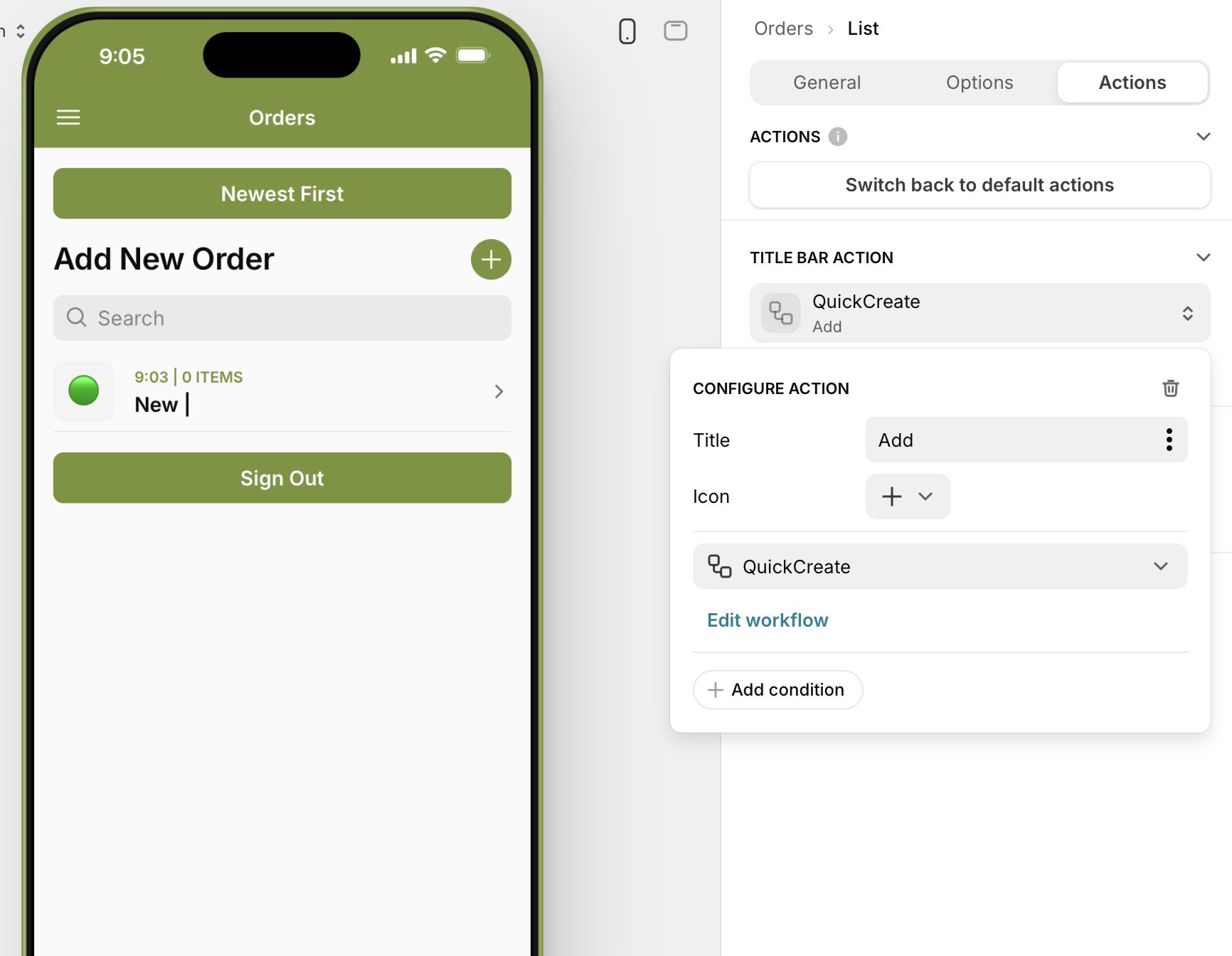
Thanks Robert, but this did not work. I did go to the title bar action for the collection (Actions section) which had a title called “Add” and changed it to “New Order” but nothing ever changed in the app. It always remained either a single “+” character or “Add +”. (Note: in the image below I have changed it back to “Add” and “+” like it was before fiddling).
However, that got me curious and looking around I tried something else which did work. Just going to the general section and under Source there is a title option. I had been using this section to label the orders as either in the “Ascending” or “Descending” order. But I tried changing it to Add New Order and voila, that did it. I actually did not need the “Ascending” / “Descending” labelling because it just duplicated what was in the “Newest First” / “Oldest First” button. So now I have a much more descriptive label for adding new orders and that should cut down on the confusion some of my users were experiencing. Thanks for pointing me along those lines.
“+” is the icon, “Add” is the title. You just have to remove the icon if it confuses your users if I understand you right.
That is supposed to be the “title” of your Collection. Usually I just leave it as “Orders” for your example, and my button would be name “Add New”.
It links to the available screen estate the system can work with. The screen estate links to your device type. Glide’s design changes based on that, hence the difference.
In your second screenshot, you’re previewing as a mobile device, hence Glide shows it that way. If you view the app on MacOS in a real environment, not the builder, it likely displays like your Amazon Fire screenshot.