Continuing the discussion from Issues with new horizontal collections! (only when used in multi column containers):
The 3 collections have the exact same settings but the sizes are different for each collection. Definitely seems to be a bug. This only happens when the container is split into 2 or more columns. (same for mobile and desktop). If the container is set to full (as in - “full width”) then the proportions are perfect for any number of items in the collection.
Note the proportions when there is only one item in the collection - the circle distorts to an oval shape as well as being the wrong size.
NB: There seems to also be an issue with square images when the container is 2 or more columns wide. Notice the second square image below is closer to the edge of the device screen so it doesn’t show a thin strip of the previous or next item in the collection. But on full width it does show. (on an older iPhone this actually cuts off the edges of the square image altogether)
This has the same setting but - the container is set to 3 columns wide - so it displays incorrectly.
Same settings with only one item in the list - displays incorrectly


The positioning and sizing is incorrect - with two items (also the 3 followers  text is on 3 different lines/rows)

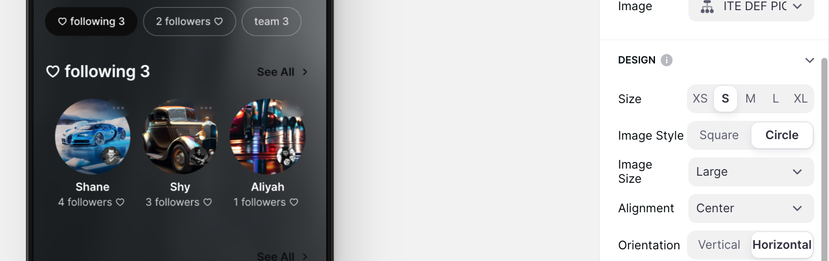
This image below is displaying correctly because its a single column OR full width container

Once you have multi column containers or custom collections then it displays incorrectly.

A 3 column custom collection: the horizontal list overlaps other columns.
