If you want to use your own SVG icons—on buttons, icons, or other elements—you can set your SVG as the element’s background and hide the original <use> to avoid overlap. This lets you apply any custom icon with your preferred color, size, and style.
.custom-icon button[aria-label="Custom Action"] svg {
    background: url('data:image/svg+xml,<svg xmlns="http://www.w3.org/2000/svg" viewBox="0 0 24 24" fill="none"><path d="M7.5 15.75C9.57107 15.75 11.25 14.0711 11.25 12C11.25 9.92893 9.57107 8.25 7.5 8.25C5.42893 8.25 3.75 9.92893 3.75 12C3.75 14.0711 5.42893 15.75 7.5 15.75Z" stroke="white" stroke-width="1.5" stroke-linecap="round" stroke-linejoin="round"/><path d="M11.5368 18.6953L14.1683 14.748C14.5641 14.1543 15.4366 14.1543 15.8324 14.748L18.4639 18.6953C18.9069 19.3598 18.4305 20.25 17.6318 20.25H12.3689C11.5702 20.25 11.0938 19.3598 11.5368 18.6953Z" stroke="white" stroke-width="1.5" stroke-linecap="round" stroke-linejoin="round"/><path d="M11.25 5.59803C11.25 5.59803 14.4125 2.83251 15.9938 4.06761C18.3502 5.90813 13.3584 8.14891 13.8854 9.16903C14.4125 10.1891 17.9368 7.98854 19.6834 9.679C20.7376 10.6993 20.0694 12.1294 19.6834 13.25" stroke="white" stroke-width="1.5" stroke-linecap="round" stroke-linejoin="round"/></svg>') no-repeat center center;
    width: 24px;
    height: 24px;
    display: inline-block;
    vertical-align: middle;
    background-size: contain;
}

.custom-icon button[aria-label="Custom Action"] svg > use {
    display: none;
}
Mazen
September 24, 2025, 10:38pm
3
Ive been waiting for it for so long!!
Yeah! I just discovered the same thing last week when attempting to change the … menu into a + menu
.plus-menu .action-container [data-testid=“menu-button”] svg {
width: 28px;
height: 28px;
background-image: (“data:image/svg+xml,%3Csvg xmlns=‘http://www.w3.org/2000/svg’ viewBox=‘0 0 24 24’%3E%3Cpath fill=‘none’ stroke=‘grey’ stroke-width=‘2’ d=‘M12 5v14m-7-7h14’/%3E%3C/svg%3E”) 1important;
background-repeat: no-repeat;
background-position: center;
transition: background-image 0.3s;
}
.plus-menu .action-container [data-testid=“menu-button”] svg use {
visibility:hidden;
}
the only thing I can’t figure out is how to get the stroke color to not be black in dark mode. I’m using currentColor in effor to change the color dynamically, but it’s not picking it up.
color: grey; kinda works…
your clip is kind of hypnotic
I discovered a condition that can be applied for dark mode (.dark-theme). You might try this:
.dark-theme .custom-icon button[aria-label="Custom Action"] svg
I did something similar on the community forum in the past, allowing custom image in list collection actions: Change The Default "Three Dots" Icon With Custom CSS In List Collection
Great job
Hi,
I neel your help,What am I doing wrong?
Can you provide some copyable code for testing?
@Himaladin of course
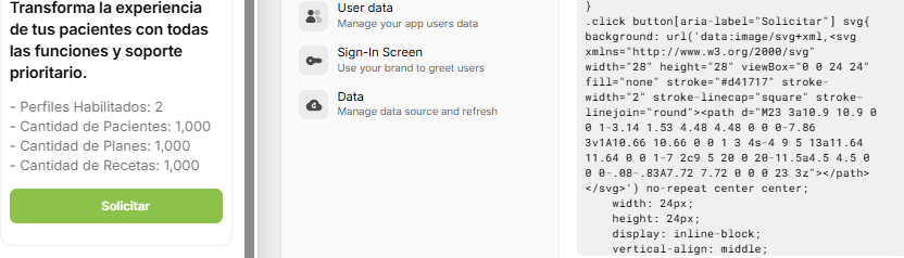
.click button[aria-label=“Solicitar”] svg{
I can’t copy the link, what page can I copy it to? When I paste it into the community post editor, it disappears
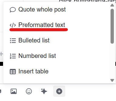
Where’s the <path> part? I mean the complete code you’re using. Use preformatted text to write that code.
.click button[aria-label="Solicitar"] svg{
background: url('data:image/svg+xml,<svg xmlns="http://www.w3.org/2000/svg" width="28" height="28" viewBox="0 0 24 24" fill="none" stroke="#d41717" stroke-width="2" stroke-linecap="square" stroke-linejoin="round"><path d="M23 3a10.9 10.9 0 0 1-3.14 1.53 4.48 4.48 0 0 0-7.86 3v1A10.66 10.66 0 0 1 3 4s-4 9 5 13a11.64 11.64 0 0 1-7 2c9 5 20 0 20-11.5a4.5 4.5 0 0 0-.08-.83A7.72 7.72 0 0 0 23 3z"></path></svg>') no-repeat center center;
    width: 24px;
    height: 24px;
    display: inline-block;
    vertical-align: middle;
    background-size: contain;
}
.click button[aria-label="Solicitar"] svg>use{display: none;}
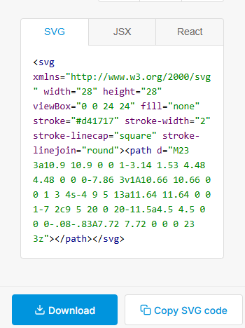
You can actually use my reference and simply ask GPT to replace the <path> for you.
.click button[aria-label="Solicitar"] svg {
  background: url('data:image/svg+xml,<svg xmlns="http://www.w3.org/2000/svg" viewBox="0 0 24 24" fill="none" stroke="white" stroke-width="2" stroke-linecap="square" stroke-linejoin="round"><path d="M23 3a10.9 10.9 0 0 1-3.14 1.53 4.48 4.48 0 0 0-7.86 3v1A10.66 10.66 0 0 1 3 4s-4 9 5 13a11.64 11.64 0 0 1-7 2c9 5 20 0 20-11.5a4.5 4.5 0 0 0-.08-.83A7.72 7.72 0 0 0 23 3z"/></svg>') no-repeat center center;
  width: 24px;
  height: 24px;
  display: inline-block;
  vertical-align: middle;
  background-size: contain;
}

.click button[aria-label="Solicitar"] svg > use {
  display: none;
}
Alternatively, you can replace the “background SVG” by using mask and -webkit-mask, which allows you to color the icon using background.
This post expands on [Screenshot 2025-11-09 111529]
Also, try testing it by removing the selector [aria-label="Solicitar"] since it may be translated. Let me know if it doesn’t work.
Have you managed to get it working?
Hi @Himaladin i only test the Svg icons, thanks

