@Jason
My apologies if this has already been pointed out, I couldn’t find this topic in the forum.
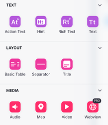
Inline list details screen: insert component
(Text apple green, Layout green, Media blue)
Component edit screen : insert component
(Text purple, Layout pink, Media red)
I was wondering what the logic behind the order of the component sections and the colors was.
It would be great, in my opinion, if the “Insert component” panels throughout the builder were consistent.
Interesting. I’ve never noticed that before. Even searching through the components presents different colors. Looks like the coloring is only related to the grouping order on the list. Whatever is up top is always green and whatever is on the bottom is always red…if that made sense. Just use the search and it will make sense.
This must be why I’ve never been able to grasp where components are located. I always feel like I’m hunting for what I need. My brain can’t associate the color to any one group type. Also items in the Pickers category in a Detail view gets grouped with the Edit Components category in a form, so some of the component flip between different categories.
The UX could be tested, but intuitively I would suggest to display the components in the “insert component panel” in the same order and with the same colors.
Vote it up! 
Even more inconsistent is when you SEARCH for a component, it will CHANGE colors from what it originally was.


