Hi guys,
I am using the following code to isolate a button at the bottom of my screen. My problem is that setting the button as “fixed” wrecks the formatting in desktop display. I’ve tried sticky too and that’s not working either. Any ideas on how to make the button scale to the right width while also keeping it isolated as the user scrolls?

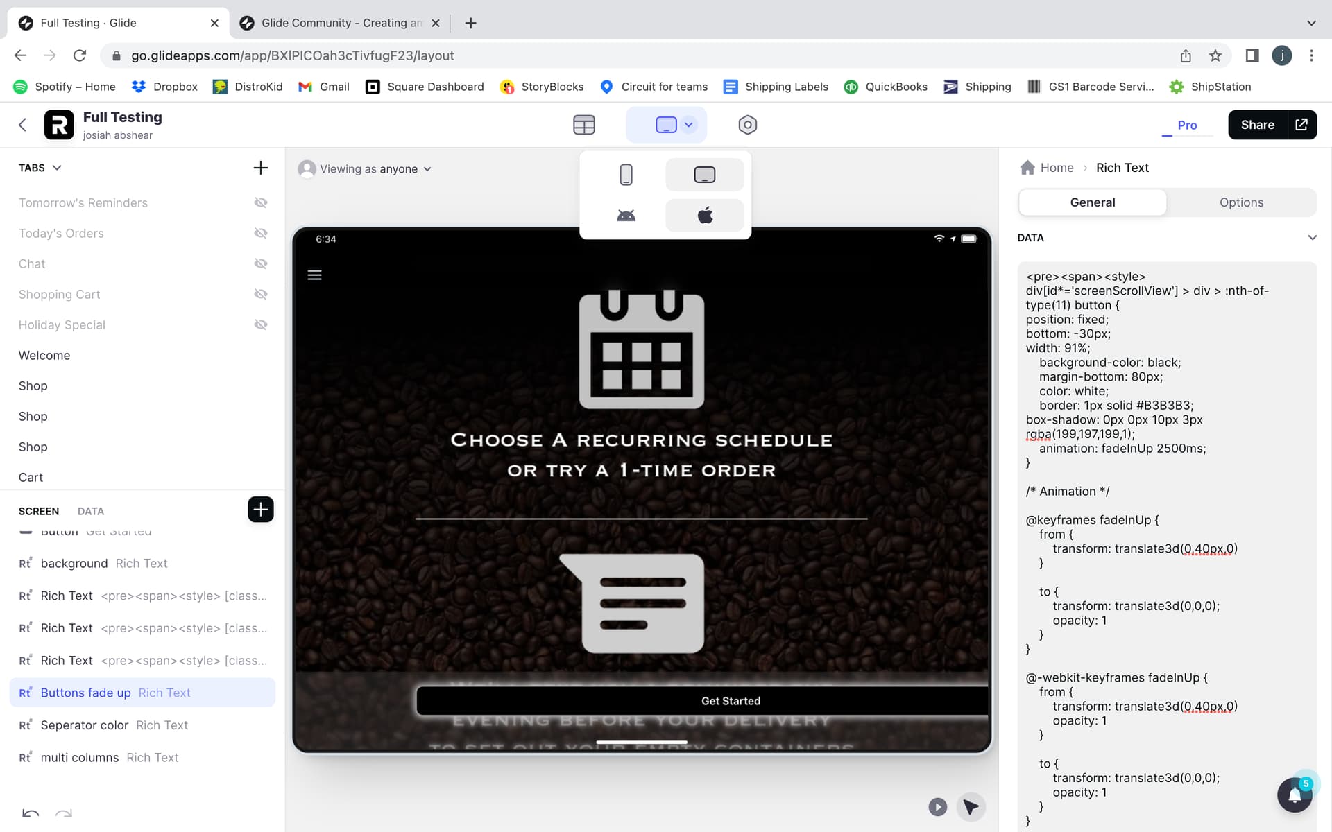
<pre><span><style>
div[id*='screenScrollView'] > div > :nth-of-type(11) button {
position: fixed;
bottom: -30px;
width: 91%;
    background-color: black;
    margin-bottom: 80px;
    color: white;
    border: 1px solid #B3B3B3;
box-shadow: 0px 0px 10px 3px rgba(199,197,199,1);
    animation: fadeInUp 2500ms;
}