Lesscode Design Library - Sep 2025
Our library is growing! Below is a glimpse of what’s new in September.
Visit the app to access the entire library:
Would love your feedback!
Display Zero Tab Badge
Forces the Tabs badge to remain visible even when its value is 0, ensuring consistent badge display across navigation.

Overlay Screen Sticky Bottom Footer
Keeps a Container stuck to the bottom of an Overlay Screen. Perfect for fixed menus or action bars that remain visible.

Top Sticky Header
Keeps a Container component fixed at the top of the page while scrolling. Most useful for creating a sticky header with custom filters that remains accessible when browsing long collections of cards or lists.

Overlapping Cards
Create a stacked Card Collection layout with overlapping edges. Customize the width, margin, and border values to control size, spacing and hover effects.

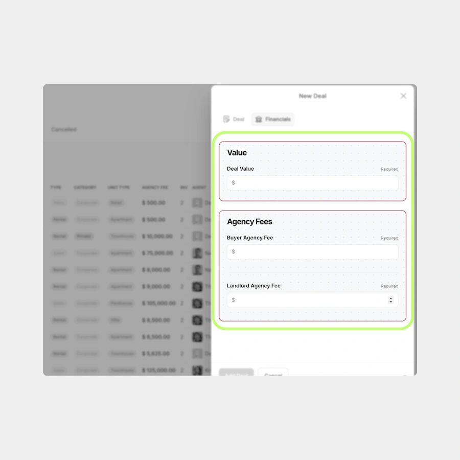
Inline Info Bar
Convert a Single-Row Table component into an inline info bar. You can add Tags, Buttons, Small Images, Text.

Also available: Free CSS Library
Split Delete Button
Makes the Delete Button in a Button Block component visually distinct by pushing it to the far right. Creates clearer spacing and helps reduce accidental taps on actions.
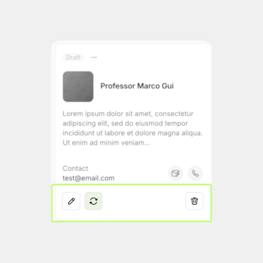
/* Split Delete Button */

.lc-buttons-split-delete button[aria-label="Delete"] {
  margin-left: auto;
}
Custom Collection Card Background
Applies a background color to Custom Collection cards and allows an optional different hover color.

/* Custom Collection Card Background */

.lc-cc-card-background div[class*="StyledDiv7"][class*="pages-component-renderer"]
{
  background-color: #E0E4F5; /* set base background */
}

.lc-cc-card-background div[class*="StyledDiv7"][class*="pages-component-renderer"]:hover
{
  /* background-color: #C7F9CD;  optional hover color */
}
Cards Menu Button Border
Adds a border around the cards dropdown Menu Button to make it more visible against the background. You can customize the border style, size and color.
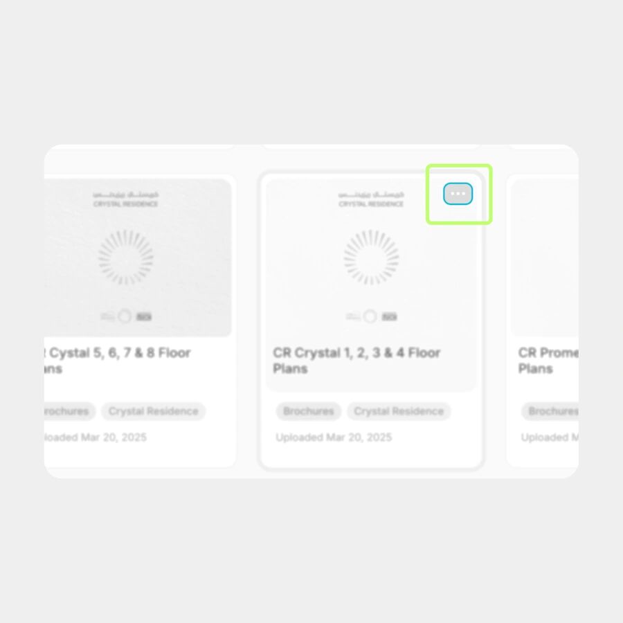
/* Cards Menu Button Border */

.lc-card-menubutton-border div[class*="StyledDiv10"] button[aria-label="Menu"] {
  border: 2px solid #2CBCD5; /* Select your border color */
}
Card Container Border
Adds a border around a Card Container to visually separate it from the background. Customize the border value to control the border width and color.
/* Card Container Border */

.lc-card-container-border div[class*="StyledDiv7"][class*="pages-component-renderer"]
{
  border: 2px solid #B24C63; /* Select your border color */
}
We have loads of CSS snippets ready to be added to the library. Visit the app and subscribe if you want access to the full collection and all future updates.
Reach out if you need custom design or improved user experience for your Glide app.