Horizontal Scroll Hint

Hello hello – quick question on Inline List Cards:

Most users on my app (70%) are not seeing the horizontal scroll suggestion (see image below). The slice of the card to the right is too small. It’s at the point where I need to find a solution or redesign this core experience of my offering.

I’m wondering if anyone has found a workaround so it is easier to see the next card in the list.

Thanks for the help y’all.

(Sidenote: I’m working a casual education project you can learn more about here)

1 Like

Exactly what we’ve been discussing here:
https://community.glideapps.com/t/inline-list-horitzontal-ortientation-issues/28431/5?u=robert_petitto

@david @tristan

3 Likes

Ahhh I didn’t see that come up. Thanks for the reference @Robert_Petitto ! I’ll stay in the loop.

2 Likes

Hi Robert, the linked page doesn’t exist anymore. Has the conversation moved somewhere else?
Tks

It’s still there, but the topic was closed.

Here is the CSS solution that was given by @ThinhDinh in that thread:

<pre><span><style>

[data-test="app-horizontal-list"] .inner {
  grid-template-columns: repeat(100, 275px);
}

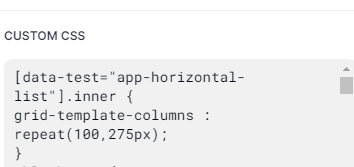
Actually, I think the reason the thread can’t be seen any more might be because the root node was deleted, which orphaned all the replies. But anyway, the above CSS seems to be the workaround.

2 Likes

Am I entering this incorrectly?
Does not seem to work.

image

This was a very old thread, with Classic Apps. The new Glide Apps don’t follow the same structure, so the code most likely wouldn’t work. Same case for most Classic Apps CSS you see in the forum.

Is there a list that has the current structure on it?

Could you produce this?

Sorry, I haven’t had much time to dive into CSS in the new Glide Apps. I almost never use it nowadays.

To my knowledge, no. Most of the users don’t have access to it anyway.

This makes a lot of the unique CSS things a guessing game. :frowning:

It’s not. I would recommend diving into the code structure using inspect element and start changing it to get the idea. As you have the ability to name the classes yourself, I think it’s much easier than what it was on Classic Apps.