I want to have the tab options either centered and spaced out more, or spaced evenly across the whole screen into 4 sections like it is in the mobile view. I’ve tried getting the class for each individual button (StyledTabsTrigger) and hovering over the text gives you StyledSpan2, but neither of these seem to do anything.
Thankyou! This has worked to an exent! It now does exactly what your example does. However, when the screen is in mobile mode, or desktop mode but in a small window, it either cuts the text short or auto-creates a dropdown to “show more”:
You might want to experiment with different flex values like 1 1 auto, or even 0 0 auto depending on how much flexibility you want. This helps control whether tabs shrink, grow, or size strictly based on content.
This worked, but when the window was small it still collapsed a bit. However, the suggestion you gave was the overall solution and @Himaladin suggestion of having flex set to 1 1 auto; topped it off. Thanks both of you this has been giving me a headache for days!
Glide has actually anticipated long tab labels — if your tabs overflow the container, they become scrollable horizontally by default. So if you’re seeing tabs “collapse” or overflow, it’s often better to let that native horizontal scroll behavior handle it, especially for mobile or smaller windows.
Also, just be aware that overriding the flex behavior with custom styles like flex: 1 1 auto; can sometimes interfere with that intended scrolling, depending on parent constraints.
By the way — I accidentally came across a CSS trick that collapses overflowing tabs into a dropdown, which could be a nice alternative. I haven’t been able to replicate it reliably yet, but it’s something I might experiment with later when I have time.
Just for fun:
You can force tab items to collapse into a hamburger menu while keeping only the first tab visible, as shown in the image below.
This CSS tweak is intended for desktop only:


 Just for fun:
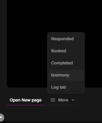
 Note: This method has only been tested in desktop view and may not work on mobile.