If you’ve been waiting for this feature request “CSS Class Name” Field bound to data, it’s still unclear when it will arrive.
In the meantime, here’s a workaround that turns the Rich Text component into a CSS-controlled state bridge — a way to make your app’s CSS respond directly to data, without JavaScript or visibility logic.
This isn’t just a hack — it’s a new architectural concept born from Glide’s limitations.
Here, CSS serves not only as a styling layer but as a logical layer that interprets DOM state.
With this method, you can write HTML directly in a Glide table column to output class names or attributes (like data-badge, data-status, or data-theme).
You can even nest attributes to represent multiple conditions, then use the CSS pseudo-class :has() to make the interface respond automatically.
As an example, I’m continuing from: Notification Badge in New Glide
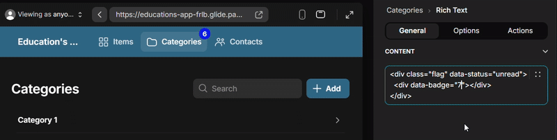
 HTML via Rich Text
<div class="flag" data-status="unread">
  <div data-badge="10+"></div>
</div>
The Rich Text isn’t visible to users — it acts as a data-driven trigger that your CSS can “listen” to.
 Dynamic CSS
nav > button {
  position: relative;
}

/* 🟣 Base badge — appears only when data-badge exists */
#page-root:has([data-badge]) nav > button:nth-child(2)::after {
  content: "";
  position: absolute;
  top: -6px;
  right: -6px;
  font-size: 12px;
  font-weight: bold;
  color: white;
  border-radius: 10px;
  min-width: 20px;
  width: fit-content;
  height: 20px;
  line-height: 20px;
  display: flex;
  justify-content: center;
  padding: 5px;
  align-items: center;
}

/* 🟠 Unread */
#page-root:has([data-status="unread"]) nav > button:nth-child(2)::after {
  background: orange;
}

/* 🔴 Alert */
#page-root:has([data-status="alert"]) nav > button:nth-child(2)::after {
  background: red;
}

/* ⚪ Read — hide badge entirely */
#page-root:has([data-status="read"]) nav > button:nth-child(2)::after {
  display: none;
}

/* 🔢 Badge values 1–10+ */
#page-root:has([data-badge="1"])  nav > button:nth-child(2)::after { content: "1"; }
#page-root:has([data-badge="2"])  nav > button:nth-child(2)::after { content: "2"; }
#page-root:has([data-badge="3"])  nav > button:nth-child(2)::after { content: "3"; }
#page-root:has([data-badge="4"])  nav > button:nth-child(2)::after { content: "4"; }
#page-root:has([data-badge="5"])  nav > button:nth-child(2)::after { content: "5"; }
#page-root:has([data-badge="6"])  nav > button:nth-child(2)::after { content: "6"; }
#page-root:has([data-badge="7"])  nav > button:nth-child(2)::after { content: "7"; }
#page-root:has([data-badge="8"])  nav > button:nth-child(2)::after { content: "8"; }
#page-root:has([data-badge="9"])  nav > button:nth-child(2)::after { content: "9"; }
#page-root:has([data-badge="10+"]) nav > button:nth-child(2)::after { content: "10+"; }
/* ⚙️ ADVANCED LOGIC — Nested conditional control
   Combine multiple states: show animation if has badge but NOT read */
#page-root:has([data-badge]):not(:has([data-status="read"]))
  nav > button:nth-child(2)::after {
  animation: pulse 1s ease-in-out infinite;
}

@keyframes pulse {
  0%, 100% { transform: scale(1); opacity: 1; }
  50% { transform: scale(1.2); opacity: 0.6; }
}
 CSS-Controlled State Logic
Through this CSS-controlled state bridge, logic expands directly within your styles.
Glide data becomes the state layer, and CSS interprets that state dynamically.
#page-root:has(.parent .child) { … }
#page-root:has(.parent):not(:has(.child)) { … }
The DOM becomes your logic model — and CSS reacts to it, without any JavaScript or conditional visibility rules.
 CSS now carries logic.
In Glide, it no longer just styles the interface — it decides how the interface behaves, based on data output from Rich Text.


 CSS Hack: Role-Based App Themes