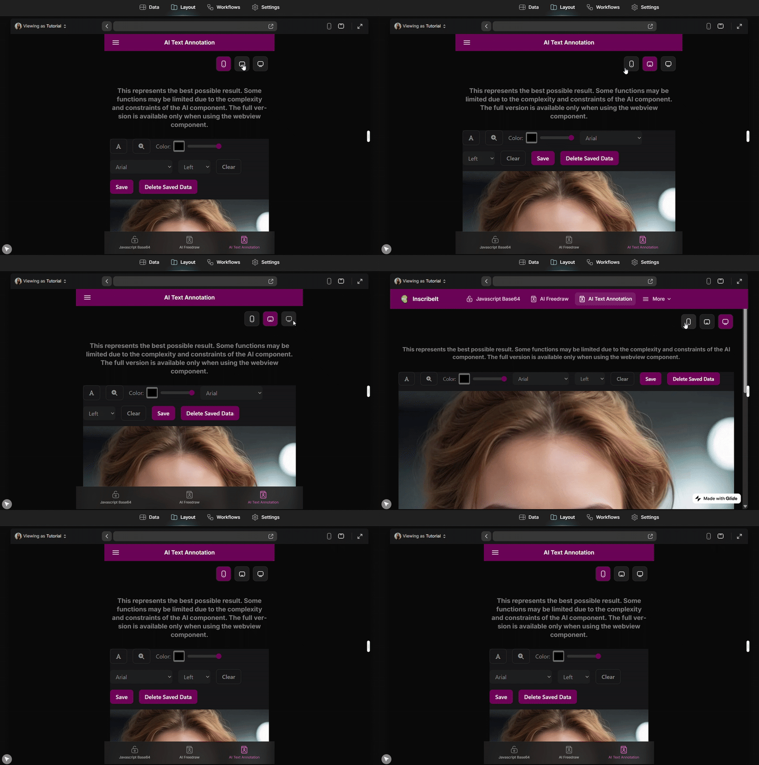
Sharing another small CSS tweak I’ve been experimenting with ![]()
With this trick you can freely set different app widths on desktop or define a default width when the app first loads.

#page-root:has(.unique-screen-size) {
  max-width: ...px;   /* set your preferred width */
  margin: 0 auto;
}
Disclaimer: Testing was done via DOM inspection and may not be fully accurate.
For other situations that require tailored CSS hacks, feel free to reach out via DM.