My app has become quite complex and given the complexity, i’ve opted to have a very different experience on mobile. As a result, I currently am hiding MANY different containers and elements that are being used on the desktop version. Ultimately this will optimize the speed of the app. I also see a super quick “flash” of elements that are hidden when my slide in pops up.
I’d love if I could use a workflow to open a completely different page on button click using screen size as a condition. This would allow me to build separate experiences and different pages based off of screen size - whereas now I just have to hide elements using conditional visability.
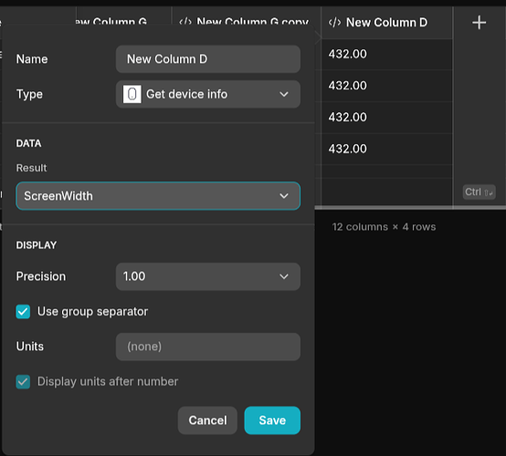
Though there has recently been the addition of conditional visibility capabilities by screen size, I don’t see that we can use screen size as a condition inside workflow.
