Can I make these edges rounded to the “text’s entry’s”?

Something like this?

<pre><span><style>
[data-test="app-text-field"] {
border: solid 2px;
border-radius: 50px;
margin: 10px;
text-align: center;
}

.tf-inner, .shadow-box, .ta-inputbox {
border: 0px !important;
text-align: center !important;
}
Hi Robert,
Is there a way to have one border while editing and another one for the normal state? I’ve tried with :focus but not worked.

Try this instead:
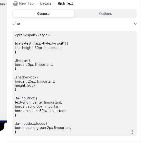
<pre><span><style>

[data-test="app-tf-text-input"] {
line-height: 50px !important;
}

.tf-inner {
border: 0px !important;
}

.shadow-box {
border: 0px !important;
height: 50px;
}

.ta-inputbox {
text-align: center !important;
border: solid 2px !important;
border-radius: 50px !important;
}

.ta-inputbox:focus {
border: solid blue 2px !important;
}

what is not working?
[data-test="app-tf-text-input"] {
line-height: 50px !important;
}

.tf-inner {
border: 0px !important;
}

.shadow-box {
border: 0px !important;
height: 50px;
}

.ta-inputbox {
text-align: center !important;
border: solid 2px !important;
border-radius: 50px !important;
}

.ta-inputbox:focus {
border: solid blue 2px !important;
}


This code
you are missing top code:
<pre><span><style>
Sir I have using above code (
) Still same working . Shadow-box border 0px But Border appears
I’m having trouble understanding what you need…
Like this sir (rounded text entry )


and is not changing the entry field?

you wanna take out the backround?
Yes
.input-wrap{background-color:transparent}
Hi @Uzo !!
Is there a way to remove that black border when :foucs?
yes:
<pre><span><style>
.input-wrap{
background-color:transparent !important;}
.focused .input-wrap{
box-shadow:none !important;}