Notification Bell Icon
I did something with @Atom a few months ago that shows a notification bell icon in Glide apps.
Setup Resources
Original discussion thread
You can actually remove the will-change: transform of the main container, and it will allow components to be shown on top of the header.
main>div:nth-child(1) {
	will-change: auto !important;
}

/*Sticky Button Container when header is inline*/
#page-root:has(.inline-nav) .bell-top {
	position: sticky;
	top: -56px;
	z-index: 22;
	height: 3.5rem;
	margin-top: -3.5rem;
	padding-bottom: 3.5rem;
}

/*Sticky Button Container when header is 2 lines*/
#page-root:has(.bottom-nav) .bell-top {
	position: sticky;
	top: -112px;
	z-index: 22;
	height: 7rem;
	margin-top: -7rem;
	padding-bottom: 3.5rem;
}

/*Correction to adjust button position*/
#page-root:not(:has(.mobile-layer)) .bell-top button {
	top: 8px;
	right: 40px;
}

/*Insert Container*/
#page-root:has(.mobile-layer) .bell-top {
	position: sticky;
	top: -110px;
	margin-top: -110px;
	z-index: 22;
	height: 110px;
	padding-top: 70px;
}

.bell-top {
	margin: 0 -20px;
}

.bell-top,
.bell-top div {
	pointer-events: none !important;
}

.bell-top button {
	pointer-events:auto;
}
You need to add a button with these settings:

Settings
| Style Property | Style Value |
|---|---|
| Style | Minimal |
| Width | Auto |
| Accent | Off |
| labels | Hide |
| Alignment | Right |
And then, add the class bell-top to the button component.


And the best part? It’s fully responsive!
Implementation Steps
1. Data Structure
Create a notification count column in your users table that will store the number of unread notifications.
2. Configure Bell Icon
In the bell icon button component, set the title of the action to reference your notification count user column:
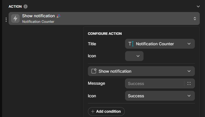
This makes the notification count accessible through the aria-label attribute:
3. Add the “Secret Conditional Component”
- Add a random component (like a text label) directly above your notification bell icon button
- Add a visibility condition to this component (e.g., number of unread messages > 0)
- Give it a custom class:
notification-bell-counter-tweak
4. Add Custom CSS
Apply this CSS to transform the aria-label into a notification counter:
.notification-bell-counter-tweak {
  display: none;
}

.notification-bell-counter-tweak + div .bell-top button:after {
  content: attr(aria-label);
  width: 20px;
  height: 20px;
  border-radius: 100%;
  top: -3px;
  left: -3px;
  background: red;
}
Result
You now have a professional notification counter that displays the number of unread messages:

How It Works
The CSS uses the adjacent sibling selector (+) to target the bell icon that follows the conditional component. It then creates a pseudo-element with the ::after selector and uses attr(aria-label) to display the notification count from the button’s title.