Also, one more thing is we are just using ‘Maker’ version.
There is a custom CSS input box.
Is it possible since we are not at a higher level it is just being ignored?
Yes, you point the title column in your component to the table column that contains those three categories. In the custom CSS box, you need to write those three categories in three different codes, like in the screenshot at the top of the thread: the “Company” column and three separate codes for each company name.
I don’t think so. If you want broader usage, it’s better to disable “use compiled CSS”.
Thanks so much for all your help.
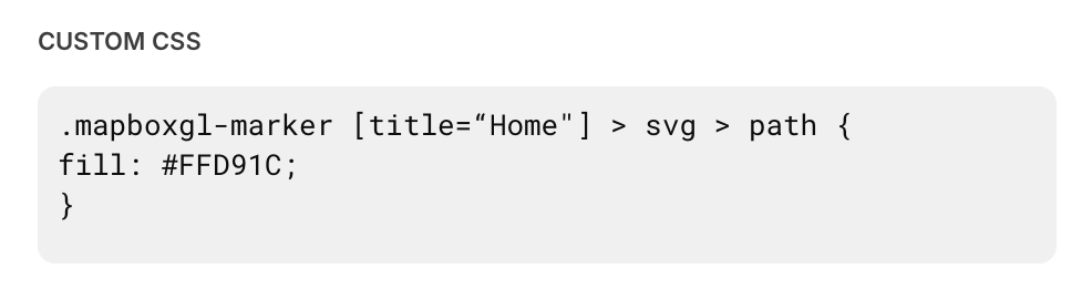
I have it working now- I was putting the custom CSS into a little box at the component level and it didn’t work there.
I added the code to the custom css in the configuration settings and that did the trick!!
If the input in that component is the place where the custom class name is provided.
Is it possible to use the image or description from the map component as the selector? If so, how do I find what to call it?

Yes, it’s possible if the image or description appears in the DOM, but unfortunately, it doesn’t show up until you click on a pin. Could you let me know what you’re trying to achieve with this?
Since the titles and colors have to be hard wired into the CSS, and our map pin titles would typically be more variable, I was just looking to tap into a different field. But a workaround would be to just reorganize titles and descriptions to make it work.
Two more questions on this topic:
- If I’d like to change the default color for all map pins, and also use the Title to add groups to any that meet that criteria, such as the example below, what would that look like?
- What’s a good reference to learn CSS syntax? I’d like to be able to troubleshoot better and understand what you CSS wizards seem to be able to generate off the top of your head.

/Map Marker - Color/
[title=“Apple Store”] > svg > path {
fill: #6253BE;
}
[title=“Samsung Store”] > svg > path {
fill: #BA55D3;
}
.mapboxgl-marker [title=“Xiaomi Store”] > svg > path {
fill: #0065cb;
}
If you want to apply a default color, you don’t need to add a title in the selector. For example:
.mapboxgl-marker svg > path {
    fill: #0065cb;
}
When you add a title to the selector, it makes it more specific, which gives it a stronger priority over the general selector.
I’m not sure where would be best for you to start learning. FYI, effective CSS application comes from understanding HTML structure itself.
You might find resources and tutorials on W3Schools or MDN Web Docs, or other resources. For quick learning, you can also learn from cases by asking GPT or on this forum.
Are we applying this into the CSS class on our map, or onto the settings > appearance > CSS ?
" .gSuSev { font-size: 0.75rem; color: var(–gv-text-pale); display: none; } " this was the CSS class applied to the map under the component by someone before me.
When adding in your code I end up with " .gSuSev { font-size: 0.75rem; color: var(–gv-text-pale); display: none; } .mapboxgl-marker svg > path { fill: #FF8800; } "
However the color isn’t changing
My code here does not add class names. You just need to copy all the code into the “Appearance” section.
Is it possible to remove class names and just apply red to all switches? Pulling from the other thread: #page-root .red-switch .peer:checked ~ div {
background-color: red;
} . Or does it not work like that?
Is it possible to change the size of the Map Markers?
Sure. Just give it a try…
.mapboxgl-marker > div > svg {
    transform: scale(1.5);
}
Also, you should never use these class names, they’re unstable.
Are the methods outlined in this thread meant to work today? I tried the simplest examples and they did not seem to have any effect on my map markers. I’m on the Maker plan.
I also tried the even simpler example that changes all marker colors:
.mapboxgl-marker svg > path {
    fill: #0065cb;
}
No luck with either. Has something changed with how this should work?
Everything is still working fine. Please make sure the “Title” of your map component is set correctly, without whitespace. Also double-check your quotation marks — using curly quotes instead of straight quotes will prevent the CSS selector from working.

Thank you, that was it. Every time I edit the text in quotes, my OS settings are changing that character to a “smart” quotation mark. I like having this text replacement setting on for other purposes so I guess I’ll just have to be vigilant about it.